Saturday, October 31, 2015

Illustration: It's Only a Paper Moon

This week's Colour Collective colour was Apricot and I went with the 1933 song It's Only a Paper Moon, music by Harold Arlen and lyrics by E Y Harburg and Billy Rose. 

It was originally written for the 1933 Broadway play The Great Magoo, set on Coney Island. It was a huge flop, and I particularly like this review from a 1998 revival:

The action opens in Coney Island at the height of the Great Depression. Nicky (...), a womanizing barker and songwriter, has fallen hard for hoochie-coochie dancer Julie (...), an ambitious entertainer whose sights are set on the Great White Way. For Nicky, Julie is the real "magoo," i.e., the woman of his dreams. However, both lovers are Olympic-caliber boozers who swan dive into the gutter at the least hint of a romantic reversal. Irritatingly, the Sturm und Drang in this show-biz soap opera is primarily of their own perverse devising.

I decided to go with a slightly seedier night-club vibe with this illustration, to match the setting the song was originally written for. No flowers and star-filled skies for this girl, and I think she's been hitting the (peroxide) bottle a little too hard...


Say, it's only a paper moon
Sailing over a cardboard sea
But it wouldn't be make-believe
If you believed in me.

Yes, it's only a canvas sky
Hanging over a muslin tree
But it wouldn't be make-believe
If you believed in me.

Without your love
It's a honky tonk parade.
Without your love
It's a melody played in a penny arcade.

It's a Barnum and Bailey world
Just as phoney as it can be
But it wouldn't be make-believe 
If you believed in me.

Here's Ella Fitzgerald singing it:


This in number 13 in my series of Colour Collective Fadeway Girls. I wonder how long it will be before they set a colour that I absolutely cannot link to any song with 'Moon' in the title? =P It was fun, this week, to work out how to keep the fadeaway dress while it was all fringing and sequins. It took a couple of tries to get it to this point, but I think it works well.


Adobe Photoshop CC2015 on a Wacom Cintiq Compaion 2. About three hours.

Thursday, October 29, 2015

Illustration: The Quest


Over the last few weeks I have taken part in Giuseppe Castellano's Illustration Department 3-Week Illustration Workshop. There aren't as many opportunities for workshops and the like here in Perth, and I was feeling a bit like I was working in a bubble - it was time to get some new feedback on my work and push myself to explore in different directions. Giuseppe's online course was perfect, slotting very nicely into a slow period of work and finishing just as work picked up again. 

In the first video conference Giuseppe went through my portfolio website, identifying pieces that worked the best and areas that needed work. He then gave me an assignment. He had flagged my heavy use of black outline in a lot of my work, and wanted to see me using a looser, non-black line, and also to tone down my colours a bit. 

My assignment was as follows:

Create a traditional piece, 8x10", subject matter open but using line that is not black and not 'outline' and a dead colour palette. 

He also suggested I look at Tony Diterlizzi and Arthur Rackham.  

The first few days after I got the assignment I was too busy to start. I had some artworks to complete, and it was also the weekend of the Kelmscott Annual Show and I spent the entirety of Saturday demonstrating portraiture and needle felting in the exhibition hall. However, I used that time to plan out my illustration in my head, sort of mentally thumbnailing. 

Lots of people, I hear, choose to redo an exiting portfolio piece with their assignments, but instead I decided to do something with a sketch that was sitting in my sketchbook, and that I thought had potential. I knew what I wanted to do with it would be difficult, so I wanted a reason to actually get started, do my best with it, and finish it.


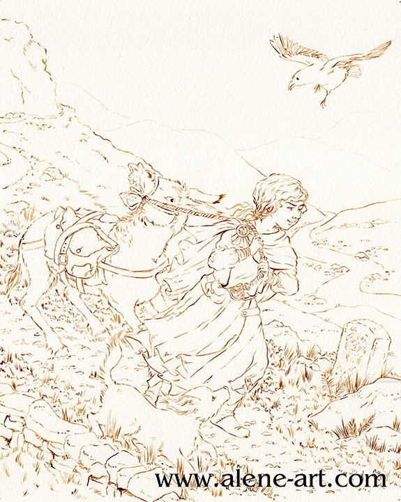
I'd picked up The Islands of Chaldea, Diana Wynne Jones' last book, in the bookshop, and sketched this while I was reading it. It was a bedtime sketch, so not particularly imaginative in terms of layout or anything, just a rough sketch based around a scene in the book.

For my assignment I didn't actually want to illustrate The Islands of Chaldea, but I thought the basic idea of a donkey that didn't want to go was a good starting point, especially as it had been suggested that I look at Tony Diterlizzi's work. To actually be an illustration for The Islands of Chaldea the girl would have to have brown hair, the raven would be a parrot, the donkey would be pulling a cart, there would be several other people and the dog would be a magical cat. 

Here is the rough thumbnail I did before I started sketching, just to check that the basic concept I had planned in my head over the previous few days worked:


I then did a rough digital sketch based around that thumbnail:


I kept each part in a different colour so that I could see what was what. Sketching can get messy and it's so easy to get lost in a mass of linework. 

I then did a refined draft linework, still digital:


As you can see, I flipped the image. Images read best left to right, but being right-handed I draw best in the other direction. Why fight it when I'm working digitally and can easily flip once the difficult bits are drawn? I also altered the donkey's expression quite a lot, to make sure it was very clearly not happy.

I had planned the image with a diagonal cut across the composition, as Arthur Rackham had been mentioned in our first conversation. I did my honours thesis on Golden Age Illustrators, with a fairly heavy focus on Rackham and Dulac, so as a bit of a nod to him I utilised I popular Golden Age compositional trick, where the composition is cut diagonally, with most of the action happening in the bottom half. This was originally inspired by Japanese woodcut compositions, after the trade borders opened up in the 1870s and it's a composition I rather like.

All these images are from my Golden Age Illustration Pinterest board. Head over there if you would like to see them bigger.

Finally I did a colour study. Not only was I going to be using a colour scheme that wasn't my usual one, but a lot of the parameters for my assignment had to do with colour and linework - none of which come across on a digital draft!


I sent this, and the draft linework, off. Giuseppe was generally happy with it, his only concern being that the raven was the only dark part of the image and threw the balance off. He suggested I darken the tones in the foreground to fix this, and gave me the go-ahead to start on the final.

Before I could start on the final, however, I had to get some ink. Easier said than done in Western Australia! I went to my local art shop, wanting waterproof ink in any dark colour that wasn't black - sepia, dark grey, paynes grey, I wasn't choosy, but the shop wasn't very helpful. In the end I managed to snag some FW Acrylic Artists Ink in Burnt Umber. It's only water resistant, not waterproof, so if I was really working the watercolour in some areas it got a bit lost and I had to go back in and touch up, but overall I think it worked well. I also bought a cheap 2/0 sable brush so that I didn't kill my expensive brushes with the ink.


Having completed the inking it was time to paint. These are the materials I used:


The red tones were used the least. I researched dead palettes before I started, and a lot of the info stressed the need for one spot of bright, saturated colour. In my case it was the hair of my girl character. I used Cadmium Scarlet and Winsor Orange for her hair, and some Rose Dorè on her skin. Indian Red added the lowlights in her hair, and was also used on some of the browns elsewhere in the image, so that the red tones were spread just a little. 
It's almost entirely watercolour, but I did get out my coloured pencils at the very end, just to darken some of the shadows and add some extra leafiness to the vegetation in the foreground, and also darkened a couple of lines with a sepia PITT Artist's Pen (not shown). 


I sent the above image off to Giuseppe and we discussed it during my final conference. 

He was happy with it, and especially pleased with my use of leading lines (in the pathway and the river) and my treatment of the fabric and the figures, but flagged a few places where it could be improved:

The sky was a bit too busy
The figures didn't stand out from the background enough
The dog got lost

I agreed with everything he pointed out, so after our meeting I took the painting into Photoshop and made some adjustments:


What do you think? An improvement? 

The sketch, being a complicated one where I was trying new things (especially with the donkey) took about 9 hours, I think, and it took another 14-18 to paint it, although there were some pauses in there while I waited for paint to dry.

Wednesday, October 28, 2015

Portrait: Myrna

I did this little portrait sample as another item to enter in the Kelmscott Annual Show. I was entering in the 'drawing' section, so I stuck almost entirely to coloured pencil, although normally I would have done watercolour underneath (especially for the background, that would have sped it up considerably!) as I am generally happier with mixed media for pieces like this. 

This is my dog Myrna. She's a cavoodle. I love her, she's gorgeous, and she knows it full well. I took the photo I used for reference a few months ago, when she was living up to her film star namesake (Myrna Loy) especially well.  


Most of this is Prismacolour coloured pencils, with just a tiny touch of Copic Opaque White and a Copic Multiliner for her whiskers - it made much more sense to add them after the rest of the portrait was finished!

Here are a couple of in-progress shots that I posted to Instagram and Twitter. Links to my social media platforms are in the sidebar. 


I do pet portrait commissions, please contact me via my website if you would like to discuss a pet portrait or any other illustration or portraiture project. 

Saturday, October 24, 2015

Illustration: Moonlight Saving Time

This week's Colour Collective was 'Dark Sky Blue' and I chose a fun little song, Moonlight Saving Time, music by Harry Richman, lyrics by Irving Kahal. 


Birdies fly with new ambition
spring is in their song
soon you’ll find yourself a-wishin’ days were not so long
If my thought is not defined, listen while I speak my mind…

There oughta be a moonlight saving time
So I could love that girl of mine
Until the birdies wake and chime 'good morning'

There oughta be a law in clover-time
To keep that moon out overtime
To keep each lovers' lane in rhyme
Till dawning

You'd better hurry up, hurry up, hurry up
Get busy today
You'd better croon a tune, croon a tune
To the lad up in the moon 
And here's what I'd say:

Say
There oughta be a moonlight saving time
So I could love that girl of mine
Until the birdies wake and chime

Good morning

The song was introduced by the inimitable Maurice Chevalier in 1931:


This is the twelfth in my series of Colour Collective fadeaway girls, each inspired by a standard song featuring the moon in the title (except two, where the moon is featured heavily in the song but not in the title). I still need to rework my very first to better match the rest of them...


The next colour is Apricot. That's going to be a challenge, but I think I have some songs in my list that could be orange, so I'm looking forward to tackling it!

Adobe Photoshop CC2015 on a Wacom Cintiq Companion 2.
About 4 hours.

Thursday, October 22, 2015

Portrait: Aishwarya Rai

I was told that I really should enter some items in the Kelmscott Annual Show this year, and that meant I had to create some pictures for that - the majority of my work, outside portraiture commissions, being illustration and therefore not really suitable for an 'Art' section's categories. 

I chose to do a picture of Aishwarya Rai in Devdas because I felt like some nice rich colours and exotic costuming: 


I moved her right arm, which was originally outstretched, so that I could fit the composition neatly in the frame I was using. It was tricky, mainly because of the weird lighting in my reference, and I don't think I succeeded quite as well as I could have wished, but I don't think she actually looks deformed, so ...

I painted the ground around the painting with a metallic gold paint, and then framed it with black cardboard as a matte. The above is a digital reconstruction of that, to save my trying to get a good photograph of the frame. I was tempted to gold-leaf around her for maximum bling, but I didn't think it was worth it. =P

Here are a couple of in-progress shots:


I used manicure dotting tools with my Copic Opaque White and Ecoline Metallic Gold for the patterned fabric - much easier than working with a brush for those tiny dots!


Winsor & Newton watercolours and Series 7 brushes on Moleskine watercolour paper. 12-15 hours overall. 

This netted me a first prize, which was nice, although I'm not entirely sure why.... I think overall this is a painting that benefits from being seen from a distance. Stand back from your computers!

Tuesday, October 20, 2015

Illustration: Under a Texas Moon

I was a bit rushed for Colour Collective this week, but still managed to produce something. It was also a bit tricky to fit the colour (Indian Red) into my series of moon songs, but I think this song works quite well. Fortunately there is a lot of scope!

The dusty red reminded me of old colour western films, and this song, Under a Texas Moon, music by Ray Perkins, is from a western of the same name - the first all-talking all-colour western - in 1930. I'm not actually at all fond of western films, and I have never seen this one. There isn't even a clip on youtube. 


When the last ray of sun,
mi querida, 
hits the hills with a soft golden hue.

When the long day is done,
mi querida,
my poor heart calls for no one but you.

Dear one,
let the spell of the fading light 
find you here in my arms tonight,
Under a Texas moon.

Sweet one,
let me whisper my love divine, 
feel the thrill of your lips on mine
Under a Texas moon.

Desert flowers,
and the strum of a sweet guitar. 
Fleeting hours,
and the gleam of a silver star,
from afar.

Fair one,
what care I what tomorrow brings?
For tonight 'tis my heart that sings
Under a Texas moon.

Here's a version of the song. I'm not sure if this is the version used in the movie or not: 


I also hope I wrote those lyrics down properly, nowhere seems to have them online (until now, I suppose!)

This definitely isn't one of my favourites of this series. I was in a bit of a rush the whole week and couldn't spend very long on it. I'm hoping to get more time for this week's colour.

There are now 11 in my series:


Adobe Photoshop CC2015 on a Wacom Cintiq Companion 2.
About 3 hours.

Saturday, October 10, 2015

Illustration: Magic is the Moonlight

This week's Colour Collective was Russian Violet, a lovely deep purple that was perfect for a magical night scene. I went to a wedding a few weeks ago which had a wisteria theme, and I'd been wanting to work some wisteria into my Colour Collective ever since - and here was the opportunity!

I chose Magic is the Moonlight (music by MarĂ­a Grever, English lyrics by Charles Pasquale) for my inspiration this week:


Magic is the moonlight,
silver stars above me
send someone to love me,
show my heart the way

somewhere in the moonlight,
surely I will meet him,
with a smile I’ll greet him
and I know he’ll stay

Lost within the splendour 
of our kiss so tender,
we will then surrender 
to a love divine 

then when love is over 
I’ll recall a June night,
for magic was the moonlight
when the world was mine

Someday I’ll meet my love

The song was originally written in 1929 as Te Quiero Dijiste (I Love You, You Said) so I went with a 20s theme for this illustration (I haven't done a 20s girl for this series yet), even though the English lyrics weren't written until 1944. I'm not even sure if the lyrics quoted above were the ones written then, as I am using the song as sung in 1950s Nancy Goes To Rio, which has different lyrics to the standard ones everyone else seems to sing. 

Here is Jane Powell singing it in the film. It is also sung as a duet with Ann Sothern with the same lyrics:  


The song is Mexican, but as I was using the English lyrics, I didn't go with a Mexican theme - I think that would have worked better had I been using the original lyrics.

This makes the tenth Colour Collective I have done in this series:


Adobe Photoshop CC on a Wacom Cintiq Companion 2
About 4 hours

Saturday, October 3, 2015

Illustration: Shine on Harvest Moon

The Colour Collective colour this week was Cadmium Yellow Pale - a throwback to the very first colour from back in January. I did a watercolour last time, so it was fun to do the same colour digitally, as part of my current Colour Collective series. 
This week I chose the song 'Shine On Harvest Moon', which debuted in the Ziegfeld Follies in 1908. No one is entirely sure who wrote it, it's credited to either Edward Madden and Gus Edwards, or to Dave Stamper.

This was an excellent excuse to go all Gibson Girl this week!


Oh, shine on, shine on Harvest Moon
up in the sky.
I ain't had no lovin'
since January, February, June or July.

Snow time ain't no time to stay
outdoors and spoon
so shine on, shine on Harvest Moon,
for me and my guy.

Want to hear it? Here's a fun version with Jane Powell, Ann Sothern and Louis Calhern:


Here's a little progress animation:


I put this together from screenshots I sent to a friend while I was painting. I started with a rough sketch in red, which is still visible under the black inking in the first shot. As you can see, I start off by sketching in the whole dress for these fadeaway girls, so that I can see where to cut away at the background, and check that the overall shape is readable before I start colouring.
Originally the trim and sash of her dress was going to be white, but I mucked about with my colour sliders on a whim, and decided that an aubergine colour was much more punchy and interesting, and also let the moon stand out more. (The poor moon is already struggling because it is impossible to actually get a night-time atmosphere with this colour!) 
All the wheat and the leaves were created with a large textured brush and the lasso tool, which is a quick way of working for pieces like this and quite fun. 

Adobe Photoshop CC on a Wacom Cintiq Companion 2 - about 4 hours, I think.
Number 9 in this series:


LinkWithin

Related Posts Plugin for WordPress, Blogger...