Showing posts with label fairy tale. Show all posts

Friday, December 14, 2018

Folktale Week 2018

I took part in Folktale Week over on Instagram. Still very busy, so a lot of my posts involved sneaky reusing and altering of existing work, but better than nothing!

Day 1: Forest 
In which I sneakily use a study of Rottnest Island, change the lighting, add some sparkles and call it good.


More below the cut:

Sunday, October 28, 2018

Mouseapple & Co

Mouseapple & Co, Purveyor of the finest novelty favours for the discerning witch. New flavour this year, 'Diabolo Menthe'. All hygienically prepared.


It had to be another quick Colour Collective (the colour was Diabolo Menthe) because I'm still super busy. When I had almost finished I toyed around with turning it into a 1900's style advertising poster, but I hadn't planned for that when I started, and I was just going to waste too much time with too much else to do. So, sorry, Random Mouseapple Employee... you just get a plain black background!

Adobe Photoshop CC2019 on a Wacom Mobile Studio Pro. About an hour. 

Sunday, October 7, 2018

Playing with Metallic Watercolours

When on holiday we stopped off in Singapore on the way home, partly to see Singapore (I had not been there since I was 6) and partly to readjust to our timezone after three weeks in the UK. And while I was there, I found a fabulous little art shop, Straits Art Co. Some friends who visit Singapore regularly told me about it, and I'm glad I hunted it down - there, I found some metallic watercolours. I'd been wanting some for a while, but they'd been proving elusive. I was able to mix and match my own palette of colours, so I grabbed silver, gold, bronze, green, blue and purple. It was a lovely little store, with lovely people.

But then it was finding the time to use them! A whole month and a half after getting back home, it was a lovely day, and it was Sunday, so I took my paints outside onto the deck and had a play for half an hour. I didn't do anything ambitious, I think the whole thing took 40 minutes, I just wanted to play with my new paints! I also tested a couple of colours of White Nights watercolour, which I had also picked up in Singapore. They were a bit more pigmented than I was expecting, but I'm sure I'll get used to that!


I took the opportunity to do a timelapse video while I was at it:


Winsor and Newton and White Nights watercolour, Copic multiliners and nameless metallic watercolours on a scrap of Moleskine watercolour paper.

Sunday, September 9, 2018

Mermay 2018

It's always fun to take part in Mermay, where you draw a mermaid every day for the month of May. Social media challenges are always a lot of fun. I don't beat myself up if I don't manage to do every day, if I'm busy, I'm busy... but if I've got a spare half hour, it's nice to sketch something and be part of the community.

Day 1:


The rest are below the cut:


Friday, September 22, 2017

By The Window

Here's the little piece I did for Colour Collective's 'Cordovan' prompt. I'm still practicing cats. 


This had its start as a sketch on my father's iPad Pro. We had the electricians in, so the power was off. I had a multitude of things I should have been doing, ranging from drawing or typesetting for work to cooking dinner or practicing the piano, but they all required electricity (my Cintiq Companion has almost no battery life. Last time I ran on battery I got 20 minutes out of it (after which it shut down without warning), and my piano is in a very dark room so I need the lights on) so I picked up the iPad and started doodling. I quite liked it as a concept, but it was horribly full of mistakes (look at the length of her legs, oops) so I thought it would serve as a good starting point for Colour Collective:


This was a quick piece, a bit over two hours overall (plus half an hour or so for that original sketch). I don't have much time to labour over Colour Collective pieces, but I like to squeeze them in as a change of pace from whatever I'm working on at the time. I enjoy coming up with something for colours I might not ordinarily use.

Adobe Photoshop CC2017 on a Wacom Cintiq Companion 2

Sunday, September 10, 2017

A Spot of Divination

Way back in highschool I drew a little witch with a goose (The goose was suggested by Monty Python-loving friends) and the other day she made a reappearance in a very quick bedtime sketch. I rather liked her, and other people seemed to as well, so the next day I spent a little time working her up into something better. I had a bit of a cold and it was nice to just draw something pointless, curled up on the couch. 


Here's the original sketch. Full of mistakes, as super-quick bedtime sketches are apt to be. Things changed rather a lot from this to the final!


Adobe Photoshop CC2017 on a Wacom Cintiq Companion 2. The sketch took under 20 minutes, the final took about two hours.

Sunday, June 25, 2017

The Little Mermaid's Transformation

Here's a portfolio piece I did recently, as part of a small series of Little Mermaid illustrations I've been doing on and off. Currently two of them are finished. 


This is the scene where the Little Mermaid drinks the Sea Witch's potion, and grows legs. You can see the jar the potion was in floating away, after she drops it in the sea. 

I really wanted to have this image with the mermaid half in and half out of the sea - we can see the two worlds here, with the waterline as a barrier between them, as this part of the story is really about the Little Mermaid leaving one world and entering another. 

Here's a progress animation:


Adobe Photoshop CC2017 on a Wacom Cintiq Companion 2. 15-18 hours. 

Monday, June 19, 2017

Ocean Views

Still busy, so to save time on my Colour Collective I revisited one of my Mermay sketches and turned it into something colourful. The prompt was 'Apple Green'


I didn't want to go with the obvious connotations of 'apple green', so I chose to use it as greenery. I looked up scenery in Vietnam, and used that as my base, as my mermaid has a conical hat and it makes sense to put her in the right region. Plus, if I was a mermaid, I think this would be good scenery to be sitting around! 

Here's the original sketch:


I flipped the image around for CC, as I decided I liked it when I flipped it to check that everything looked okay. 

I did this pretty quickly, in about three or so hours, including the initial sketch. Lots of use of the dry gritty gouache brush in Photoshop, and not being too bothered about the fine details.

Adobe Photoshop CC2017 on a Wacom Cintiq Companion 2

Saturday, June 10, 2017

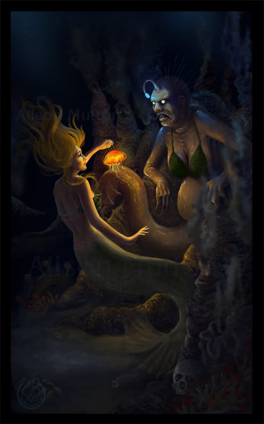
The Sea Witch

Here's a piece I redid for my children's illustration portfolio.


It was originally a realistic digital painting done way back in 2011. It was mainly to prove to myself that I could create something dark and scary, as with almost everything we were supposed to do at uni. I'm not really a dark and scary person, so I always struggled with that a bit, and wanted to see if I could create something scary off my own bat, a couple of years after I left uni. 

Here's the original. There's no place in my portfolio for anything like this now, so I took the concept and turned it into a children's illustration. I quite like redoing old pieces, if I think the concept is strong enough. It lets me see how much I've progressed, and also gives me a chance to fix all those little things that end up bothering me after I've finished a piece. 


Of course, turning it into a children's illustration meant that I no longer had to make it super-scary, which is much more my cup of tea. =P 

Here's a progress animation:


What do you think? Which version do you prefer?

Adobe Photoshop CC2016 on a Wacom Cintiq Companion 2. About 12-15 hours, I think.


Sunday, June 4, 2017

Meaningful Conversation

Baker Miller Pink for Colour Collective! This pink was developed through studies to reduce stress and aggravation - a fascinating history for a colour, and it was really quite a shame that I'd had a really good day and was in really good mood anyway while working on this. What a waste! =P 


It being MerMay on social media, whenever I hadn't had a topic in mind for my bedtime sketches I'd been doing mermaids. The idea is actually to post a mermaid a day, but I don't have time for that. However, mermaids are nice and girly and all the work I am doing at the moment really isn't, so they're great for a bit of a wind-down in the evenings! This piece was based on this very very quick sketch I did earlier in the week:


I'd just finished off the book dummy for Sioban Timmer's Feral Fergus, which is a fabulous book, but very much gross-boy-themed. So it was fun to just go all-out super girly with this. Pink! And more pink! And Mermaids! And pearls! 

Here are some other (super-quick and messy) sketches I did on the Mermaid theme during may:


More below the cut:

Sunday, May 28, 2017

Stardust

When Colour Collective's 'Lemon Chiffon' prompt rolled around, I'd just finished the audiobook of Neil Gaiman's Stardust, so that seemed an apt topic for a pale yellow:


I had fun working on this. I've been doing lots of different projects - illustrations for science workbooks, precise drawings for a chiropractor, and a gross-out picture book aimed at boys - so it was nice to just go super-girly with sparkles and pretty dresses. 

For your amusement, here's a sketch I did of Yvaine in Stardust earlier in the week. It was done extremely quickly in the few minutes before bed, her head is too big and stuff, but you know, we can't have every sketch turn out perfectly (do any of them?). She looks pretty unimpressed at being so out of proportion. Sorry Yvaine....


Adobe Photoshop CC2017 on a Wacom Cintiq Companion 2. Two to three hours (and 15 or so minutes for that sketch)

Monday, May 22, 2017

Sweet Dreams

I've been very busy lately, but I try to snatch a little time for quick sketches before bed. And I try to snatch just a little extra time for Colour Collective. The result is a bunch of very sketchy Colour Collectives, but at least I get something done!

This one was for the 'Kingfisher' prompt. I'd seen some light-up star cushions in my reference-searches around the internet, and they were just crying out to be put in an illustration, so I used them as my base and threw this together in rather less than two hours. Overall, I quite like it as a concept (although it's scarily full of mistakes)!


Adobe Photoshop CC2017 on a Wacom Cintiq Companion 2. Under two hours in total.

Monday, April 3, 2017

The Golden Ball

I always seem to be doing my Colour Collective pieces in a rush lately! I threw this one together in a couple of hours, as quickly as I could. Originally I had intended to include the Frog Prince himself, but on the whole, I'm glad I didn't have time to do so. I think the image is stronger without him.


The prompt was 'Bluebell', which is the blue I used in the background. Of course the obvious thing would have been to draw actual bluebells, but since when is obvious fun? 

About 3 hours in Adobe Photoshop CC2017 on a Wacom Cintiq Companion 2.

Saturday, April 1, 2017

Bramble and Briar

I'm dividing my new website by age (so children's, middle grade, young adult) rather than the previous division of colour/black and white, digital/traditional, and realised that my Young Adult section was a bit thin. While staring into space trying to think of something to do for it, my eye fell on a portrait I did of a friend back in year 12, as one of the three paintings I did in TEE art. It's very dated now, my skills have improved so much, and I was never entirely happy with it as it was - and what better to put in a Young Adult illustration portfolio than a redo of a piece I myself did as a young adult? Plus, I'd come across the photos I took for it back in the day, while I was sorting out files on my computer. It was fate!

Here's the final piece:


I designed it as a book cover. I know everyone generally says that you shouldn't include text in your illustration portfolio as illustrators aren't qualified to work with type - but I have a degree in design, and I do a lot of work for self publishers, who need to see that I can apply type to a cover for them. So as a compromise, I have a version with text available upon roll-over on my website. Best of both worlds!


This isn't a real book. I came up with a title that fitted the image, and used a random name generator until I snagged one I liked for the author. I envisage that text being shiny gold foil....

It's quite a radical departure from the original painting I did back in 2004. I was referencing the Pre Raphaelites when I did it, and looking at the Victorian language of flowers. The plan was to do something very lush and a bit Bollywood inspired, with a huge bunch of white carnations, with a single red rose in the middle. But my art teacher didn't like that idea, and insisted I use coloured carnations, which really mucked up the message. I didn't paint the flowers very well anyway (not aided by the fact that I was working in oil paint, which gives me a bad migraine. Not the best situation for good painting!)

Here is the original:


Yeah. Oil paints really aren't my thing! 

So this was a chance to do it over, see how much I'd improved, and get more of the feel I'd originally been going for when I did the painting. However, I'm still scarred from painting all those carnations with a migraine, and I just couldn't bring myself to do a page full of carnations. So I went with all roses, influenced, no doubt, by the fact that I was listening to Robin Mckinley's Rose Daughter at the time.

Here's the reference photo. Isn't my friend gorgeous?


And here's a progress animation:


As you can see, one of the final stages was to add a colour adjustment and some lighting. That's the beauty of Photoshop. I also duplicated a lot of the roses, for which I am not sorry. =P 

All-up this took about 20 to 25 hours, and I did it in Adobe Photoshop CC2017 on a Wacom Cintiq Companion 2. No oil-paint-migraines for me this time!

Thursday, March 23, 2017

Birdsong

I was inspired by the enormous turbans of Nihang Sikhs for Colour Collective's 'Deep Koamaru' prompt. I'd had pictures of them pinned to Pinterest for quite some time. It's always good to have boards that you can just scroll through until inspiration hits!

Here's my illustration, thrown together very quickly. It's another of those Colour Collectives that I think have much more potential, and may indeed grow into something bigger in the future... But I didn't have enough time to do it full justice and still hit the CC deadline! We'll call it an extended concept sketch. =P 


And here's the photo (taken by Mark Hartman) that started me off:

The Nihang Sikhs, The Army of the Eternal | Mark Hartman
Source: Mark Hartman: http://www.ritebook.in/2014/06/the-nihang-sikhs-mark-hartman.html
Adobe Photoshop CC 2016 on a Wacom Cintiq Companion 2. A couple of hours all-up.

Sunday, February 19, 2017

CC Moroccan Blue

Heavens, I'm a bit behind on my blogging! The beginning of the year is always flat-out for me, and writing for blog posts was way down on my to-do list!

Here's a little piece I did for Colour Collective's 'Moroccan Blue' prompt. I went with The Little Mermaid:


I was inspired by a sweet photo by The Burleigh Princesses on Instagram, which popped into my feed that week:


I wish I'd had more time, I didn't really do justice to my reference, but on the whole I think it works quite well. The fireworks were a lot of fun!

Adobe Photoshop CC on a Cintiq Companion 2.

Thursday, December 22, 2016

Winter Magic

Here's my piece for the final Colour Collective of 2016 - the prompt was 'white', and I didn't quite have enough time to do justice to what I wanted to draw. (December is so busy!) But that's okay, a lot of my Colour Collective pieces are like extended drafts - I can try out ideas, and further down the track I might work them up into something better. Once I've got the idea down, I won't forget it, and if I've done it for CC I can come back later and see all the things I want to change!


Here's a quick progress animation. I really only worked on this over one evening, so I only took screenshots of four stages - initial sketch, sketch, flat colour and final:


Adobe Photoshop CC 2016 on a Wacom Cintiq Companion 2. About 5 hours. 

Sunday, November 20, 2016

The Dance of the Sugarplum Fairy

For Colour Collective's 'Gold' prompt I thought I really needed to do something Christmassy. To have 'Gold' so close to Christmas (even if it is still November)... I just couldn't pass that up. There's been lots of advertising for The Nutcracker around, so I used that as my inspiration. I've never actually seen The Nutcracker, but I didn't let that stop me!

The Sugarplum Fairy is generally (as far as I've seen) shown dressed in mostly white, a very pale and etherial being, but I wanted to change things around a bit. As she lives in 'The Land of Sweets', I was thinking it would be nice to have lots of chocolate and caramel colours (classier than candy cane red and white), and a generous helping of icing-sugar sparkles. There are various conflicting stories on what 'sugar plums' actually are: I grew up with my mother telling me they were actually prunes, and the internet gives me options ranging from sugared almonds to truffles of dried fruit rolled in brown sugar, to purple sugar-coated sweets to preserved plums. So lots of room for interpretation there! (that, or no one knows what they're talking about at all, in which case I can't get it wrong!) 

'

I chose to have a dark fairy for a number of reasons - dark skin looks so lovely against dull golds, it adds to the 'chocolate' theme, and sparkles show up beautifully, so she could have a proper dusting of icing sugar and look fabulous while rocking it. 

I took screenshots of Nina Kaptsova dancing so I could get a pose from the actual choreography. Here's the screenshot I used:


And here are a couple of progress shots:


As you can see, I flirted with the idea of an icy blue night-time background for a while, but in the end I decided to use as much gold as possible. I kept the background fairly muted to help her stand out.

I'm really pleased with how her tutu and wings came out - They were mainly created with Kyle Webster's 'Gouache Bonus Gritty' brush, on multiple layers with opacity lowered. Very easy, and I think very effective!

4-5 hours in Adobe Photoshop CC 2016 on a Wacom Cintiq Companion 2. I hear a new Wacom mobile tablet is coming out, and I'll be interested to see if they've fixed the myriad problems I've got with mine. A charging pin that works would be an excellent start....

Saturday, September 17, 2016

Butterflies and Secret Portals

For Colour Collective's 'Sage Grey' prompt I was inspired by Scandinavian tales. Sage is an herb, of course, but it can also refer to someone who has gained wisdom, so I decided to use that meaning to direct my illustration, and created a wise troll character to blend in with the grey rocks. I do like to try different things with my Colour Collective pieces, it's such a good opportunity for experimentation!


I was also heavily inspired by Swedish golden age illustrator John Bauer, who illustrated for Bland Tomtar Och Troll (Among Gnomes and Trolls), a Swedish folklore anthology, from 1907 to 1915. He was succeeded by Gustaf Tenggren. I looked at a lot of Bauer and Tenggren's work when I did my thesis on Golden Age Illustrators, but didn't have any opportunity to be influenced by their Scandinavian aesthetic in my own work at that time, as it didn't match my thesis project, which was much more influenced by the Russian and Turkish elements of Golden Age illustration.

Image from Wikipedia
Here's a progress gif. I worked on it in brief snatches over the week, and in total spent about 8 hours on it, almost all as wind-downs after finishing my day's work. If I'd had more time I would have liked to have added more details, more beads and leather and the like, like the trolls in Bauer's work above.... but as it is, I'm pretty swamped with work so I kept it minimal. I had a lot of fun doing those curvaceous rocks!


And here's a detail of the faces:


Adobe Photoshop CC2015 on a Wacom Cintiq Companion 2, using Kyle Webster's brushes.

Monday, July 11, 2016

100 Days of Old Movies: Instalment 8 (70 – 80)

Here's instalment 8 of my 100 Days of Old Movies. The finish line is drawing ever nearer!

70, 71 & 72: The Philadelphia Story (1940)


You're not doing it to soften the blow, nor to save my face?

The Philadelphia Story is a definite classic, and was remade in the 50s as the Cole Porter musical High Society with Bing Crosby and Grace Kelly. In the original, however, we have Cary Grant, Katherine Hepburn and James Stewart. 
Society girl Hepburn is getting married, and some reporters have come down to cover the wedding (James Stewart and a female photographer). Keeping the reports to what the family wants to convey proves tricky, however, what with Hepburn's ex husband (Cary Grant) wandering in and out, and her womanising father turning up unexpectedly. By the end of the film, Hepburn has three men to choose from - her fiance, her ex husband, or the reporter. Two of them worship her, but does she really want to be worshipped?


More under the cut:

LinkWithin

Related Posts Plugin for WordPress, Blogger...