Friday, July 31, 2015

Illustration: Jane Eyre

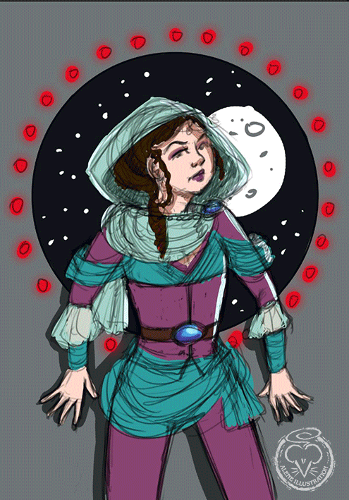
This started out as just a sketch, as my default for 'what should I sketch?' is 'Whatever I am reading and/or listening to at the moment' but I liked how it was going, and just kept plugging away at it.

In case you couldn't tell, 'what I was listening to' was Jane Eyre, which was my new audiobook this month, read by the always-fabulous Juliet Stevenson. I'd probably be quite happy if she read all of my audiobooks. 

I'm not entirely sure exactly when Jane Eyre is set. According to the end of the book, it should be set mainly in around 1837-38, but the descriptions of clothes and hairstyles could, at various times, be anywhere in the 40 years before that and at one point she mentions Marmion as a 'new publication' - and that was published in 1808. So I plumped for somewhere in the middle and went with a vague date in the 1820s.

The scene I chose for my sketching was Jane's wedding to Mr Rochester - it is not going well. Plenty of excuse for Drama and Lighting. 


“That—if a genuine document—may prove I have been married, but it does not prove that the woman mentioned therein as my wife is still living.”
“She was living three months ago,” returned the lawyer.
“How do you know?”
“I have a witness to the fact, whose testimony even you, sir, will scarcely controvert.”
“Produce him—or go to hell.”
“I will produce him first—he is on the spot.  Mr. Mason, have the goodness to step forward.”
Mr. Rochester, on hearing the name, set his teeth; he experienced, too, a sort of strong convulsive quiver; near to him as I was, I felt the spasmodic movement of fury or despair run through his frame.  The second stranger, who had hitherto lingered in the background, now drew near; a pale face looked over the solicitor’s shoulder—yes, it was Mason himself.  Mr. Rochester turned and glared at him.  His eye, as I have often said, was a black eye: it had now a tawny, nay, a bloody light in its gloom; and his face flushed—olive cheek and hueless forehead received a glow as from spreading, ascending heart-fire: and he stirred, lifted his strong arm—he could have struck Mason, dashed him on the church-floor, shocked by ruthless blow the breath from his body—but Mason shrank away, and cried faintly, “Good God!”  Contempt fell cool on Mr. Rochester—his passion died as if a blight had shrivelled it up: he only asked—“What have you to say?”
There are three main stages in this illustration. I'm not quite organised enough in Photoshop to keep to just three layers though... 

Here is the initial linework, where everything looks a bit stiff and confusing:


And here I have added some crosshatching to build up the shapes and shadows before adding the greyscale painting:


Adobe Photoshop CC 2015 on a Wacom Cintiq Companion 2
About 10-15 hours, over four evenings. 

Wednesday, July 29, 2015

Evolution of a simple BLM illustration

I've done a lot of illustrations for Blackline Master books in educational publishing. Here's a look at the process behind a simple BLM illustration:

My brief for this illustration was for the upper body of an traditional Australian Aboriginal mother holding a baby, for a section on totems in the First Contacts Year 4 curriculum. 

My first move was to browse google for a pose that would work. As I was drawing traditional Aboriginal peoples, I had to draw the mother and baby so that no 'naughty bits' were visible - this is for a year 4 curriculum, after all! 

I chose this image:

Image from shutterstock.com

I wasn't planning on using the reference exactly, really I was just after a pose that hid boobs and bottoms. Looking at the reference I sketched a really rough outline in purple, and then got rid of my reference, as I no longer needed it.  Previously I would do this stage on paper with a coloured lead, but I find it easier to draw directly onto my cintiq companion and it saves scanning. It was a little tricker using my Intuos, I found my sketching was much more stilted. 


Still using a purple brush, my next step was to refine that rough outline on a new layer. 

I then created another new layer, and started to digitally ink over my rough with a black brush. I got partway through before I decided that the baby was too old, so I did some rearranging to get the baby closer to a newborn. 

At this point I was mostly finished, but I didn't like the mother's hair, so I gave her a revamped hairstyle. 

My final step was to add some darker outlines, which is my standard practice for BLM illustrations. I feel the thicker lines give some definition to the main shapes, leaving the thinner lines to show the details, and it's less likely for everything to get lost in a sea of linework. I like things to be clear, and it's important that kids can see what's what at a glance. 

Here's the final:


Adobe Photoshop CC 2015 on a Wacom Cintiq Companion 2

Sunday, July 26, 2015

Colour Collective: Fire Engine Red

I had time to do a proper illustration for Colour Collective last week! 

I was sitting not-really-listening to 7.30 and trying to think of something fun to do with the week's colour - fire engine red - when a current affairs story about India started and the accents worked their way into my consciousness. So I decided to do an illustration with an Indian theme, which would really allow me to show off the red with a background of lush greens. 

And having decided on the theme, how could I resist adding in a baby elephant?


I wanted the focus to be on the central figures, so I used most of the red there, with a highlight of shocking pink to really make the colours pop. However, to unify the whole image, I added some bright red bougainvillea. I was trying to be a bit looser overall, so I didn't outline each flower and frond in the background, but chose a sketchier approach.  

Adobe Photoshop CC 2015 on a Wacom Cintiq Companion 2

Monday, July 20, 2015

What I Wore July 19

It's been a while since I did a What I Wore picture, but I went out to a lovely high tea to celebrate my Father's 70th (slightly belated, it was the last in a string of celebrations, which were held when the invited people were all free.) and wanted a fun and pointless way to spend a lazy Sunday evening, and decided I would do one:


I drew this up in Adobe Photoshop CC 2015 on a Wacom Cintiq Companion 2

Wednesday, July 15, 2015

Illustration: Ahmali

Remember my Colour Collective Aubergine? I said I'd like to work up the general pose into something better... and I wanted some more book covers for my portfolio, so I've come up with this:


This picture inspired my friend Makenzi Crouch to muck about with a bit of a story for this character, to go with the cover - so when it came time to add text, I used her name instead of coming up with a random imaginary author. And let's face it, she's got a pretty awesome name for an author, hasn't she?

Here's the cover without the text:


I really just let this piece go where it wanted, which was fun. I didn't have anything I had to keep in mind, no specific character to draw, no specific scene, no client to please - I just started with a fuzzy photo reference of myself in the pressed-against-the-wall pose, decided that the vastness of space outside would make the nowhere-else-to-go idea more dramatic... and then I just had fun with the costume and a general sci-fi atmosphere.

Here's a progress gif showing how this came together:


Adobe Photoshop CC 2015 on a Wacom Cintiq Companion 2

Sketch: Morticia

Yesterday I woke up with a migraine that had crept up on me while I slept, so I couldn't see the signs and take my preventative medication. Not amused! I had to spend the day in bed, and after I had managed to drag myself up I still didn't have enough brain to actually do any work. If it involved thinking, it was too hard. But I felt very unproductive and wanted to draw something - so I took my inspiration from the Daily Doodle topic on Twitter. This week they are doing The Addams Family, and the Tuesday topic was Morticia.


"Black is such a happy colour."

I just grabbed a nice photo of Caroline Jones in the role (I first came to the Addams Family while Angelica Houston was in the role, but the only Morticia who really works for me is the piquant and delicate Jones) and drew it up in a stark black and white digital sketch. I didn't have to think too much, so it was just what I needed. 

Photoshop CC 2015 on a Wacom Cintiq Companion 2 - about 30 minutes.

Tuesday, July 14, 2015

Baby Card: Lapphunds

It's been all go on the baby front the last week. First my cousin had a baby girl on the 8th (and I designed this card for her) and then my friends had a baby boy on the 11th - another card was needed. I decided to feature their two Finnish Lapphunds, which have featured on their Christmas cards for 2013 and 2014. I was originally going to draw each dog sitting proudly on either side of a blue crib, but my mother thought I should continue my theme of babies-sleeping-on-animals, so this is what I came up with:


I used a font from the Nexa Rust suite because I wanted to steer away from being too cutesy, and kept my colours bold to contrast with the two dogs.

When we went to visit the happy parents and the new arrival in hospital, I took the card, a book for baby (I had picked the book earlier, it didn't occur to me until yesterday that a book entitled 'Hi' is incredibly apt for a welcome present!) and a little charm for the new mum, who has had a rough ride and needed a present too. 


Adobe Photoshop CC 2015 on a Wacom Companion 2 and a Wacom Intuos 5.  

Saturday, July 11, 2015

Colour Collective: Corn

This week's Colour Collective prompt was 'corn'. I hadn't really decided what to do with it, when my cousin suddenly had a sweet baby girl (about two weeks ahead of schedule) on Wednesday and I needed a baby card, stat! My cousin likes the colour yellow, so, meant to be, right?


I always like to do a special illustration for baby cards, rather than rummaging through my files of card designs that I've already used for other people, because the birth of a baby is such a special occasion. In this instance, the nursery has a lamb theme (I did the lamb baby mobile for this cousin's baby shower) so I kept with that theme. 

Here's a look at how this picture came together:


I started off with a very rough sketch, refined it a bit, then did some linework with a thin semi-transparent brush in brown. Then I added flat colours, a bit of shading, and then a lot of flowers, all in corn yellow.

Here's the finished card:


Adobe Photoshop CC on a Wacom Companion 2 - about 3 hours, I think.

Saturday, July 4, 2015

Colour Collective: Aubergine


The Colour Collective prompt this week was 'Aubergine' - it's a fabulous colour, and I didn't want to miss out, but I'd been keeping myself pretty busy all week, and the time I'd planned for Colour Collective ended up being spent rescuing a client piece where the parameters suddenly (and rather drastically) changed (thank heavens for Photoshop, what would I do without it?)... and in the end I had about 75 minutes in which to whip up a piece....

So I flicked through my current sketchbook, looking for anything that might conceivably work with aubergine, passed a few medieval ladies, and settled on this rough sketch that I had done one night when I couldn't sleep. I'd grabbed a random book (Heyer's Beauvallet) and used that as a prompt, because the idea was to sketch until I was sleepy, not to use my brain in thinking of something to sketch. 


Beauvallet is a very early Heyer book, so heavy on the Description and the Drama and the Derring Do:

Backed against the wall, with hands laid along the panelling to either side of her stood a lady, a lady all cream and rose and ebony. Cream her skin, and rose her lips, ebony the lustrous hair confined under a net of gold. Her eyes were dark and large under languorous lids, the brows delicately marked, the nose short and proud, the full lips curved and ripe. She wore a gown of purple camlet, worked cunningly with a pattern of gold thread, with a kirtle of armazine to fall from the veriest hint of a farthingale. Behind her head reared up a high ruff of lace sewn with crystals. It framed a face piquant and lovely. The square of her bodice was cut low across her breast; a jewel lay upon the white skin, rising and falling with her quickened breath. 

I do not habitually draw Elizabethan costume, and the sketch was done while I was in bed, and not about to do any research, so ... yeah, ignore the blatant inaccuracies. I might see if I can turn this into something (much) better for my portfolio, as I like the basic pose and sense of drama and if I change most of it it could probably work for a kidlit cover... 

Adobe Photoshop CC2015 with a Wacom Cintiq Companion 2. About an hour and a half, including the sketch

Friday, July 3, 2015

Website Mice

I've just got my redesigned website up and running. The old one was giving me a definite pain, and wasn't easily updatable, so this time I used Adobe Muse to create my website. This meant I didn't have to do any coding, which was much better all round (I have no idea what I'm doing when it comes to code). I wanted to move away from the lightbox effect of my previous website, so that people can scroll through all the illustrations on a page quickly without having to wait for the lightbox to load, but I also didn't want to completely follow the trend of minimalist portfolio websites, which I personally find can all merge into one if I look at enough.

The main portfolio page on my new website
My old website featured some mice, and I had found that they set me apart from other illustrators quite well. People would say 'oh, you're the one with the mice!' - and anything that makes me more memorable is good! So I was determined to keep the mice theme, and did a few small illustrations to feature in the website redesign:

This is the main illustration for the homepage, featuring three mice and some areas where I can easily drop in new illustrations to feature. The rest of the website only has the shelf visible, without any of the items sitting on it.


This little mouse hangs around on my 'About' page:


A mouse to fill some space on the 'Contact' page:


And this mouse only appears if someone sends me a message via my contact form, to let them know that the message was successfully sent:


And here is a reminder of what my website used to look like:


I'm really happy to have my new one up - there are still a few illustrations I want to finish for it, but it's much more up-to-date than my old one, and it should be much easier to keep it updated. 

All images were created in Adobe Photoshop CC 2014 with a Wacom Intuos 5 and a Wacom Cintiq Companion 2, and the website itself was built in Adobe Muse CC 2014/2015.

Colour Collective: Tangerine

This is last week's Colour Collective. The prompt was 'Tangerine', which made me think of deserts. 


I mucked about with flat colours (and not too many of them) and had fun making each genie's costume a little different, while keeping to a basic theme.

Adobe Photoshop CC with a Wacom Cintiq Companion 2.

Wednesday, July 1, 2015

Colour Collective: Mint Green & Blue Grey

Here are two little illustrations I did for Colour Collective on Twitter.

This one is for the 'Mint Green' prompt. 
I went to Penrhos College during highschool, and our summer uniforms were this colour (it did not suit me), so the two are forever linked in my mind. 
The uniforms are quite different now, it's ten years since I graduated (I feel old) - but that didn't stop me whipping up a couple of Penrhos students of the early 2000s, complete with bright lever-arch files and huge heavy laptop bag. 


The next prompt was 'Blue Grey' - I'd just been to see the WA Academy of Performing Arts brilliant production of Legally Blonde The Musical - very peppy and very pink - so I used that theme for this little piece, as I couldn't imagine Elle approving of anything in a blue grey colour scheme. 


Both of these were done (rather quickly, about 2 or so hours each) in Adobe Photoshop CC with a Wacom Cintiq Companion 2 

LinkWithin

Related Posts Plugin for WordPress, Blogger...