
Earlier this year I had the pleasure of illustrating the cover for HM Waugh's debut middle grade adventure, The Lost Stone of SkyCity with Fremantle Press. To celebrate the release of the book today, here's a little look at the process I went through.

See more after the break!
I was sent along the unedited manuscript, along with descriptions of the main characters, and a note that the author herself likes the type of middle grade adventure cover with the main characters standing together in front of a killer background. The first thing I did, of course, was read the manuscript, which was a lot of fun, and then I set about coming up with some rough concepts.

I sent through four concepts to start with, three following the theme of 'main characters in front of killer background' and one wildcard showing a scene from the story:
That wildcard concept was chosen, but it was requested that I switch the characters round, so Sunaya, our heroine, was rescuing Praseep, instead of the other way round. A change was made to the manuscript to reflect this.
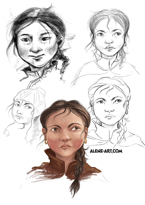
The next step was pinning down the characters. I spent the most time on Sunaya, and after that Praseep just fell into place:


Once everything was approved I could move on to the draft:
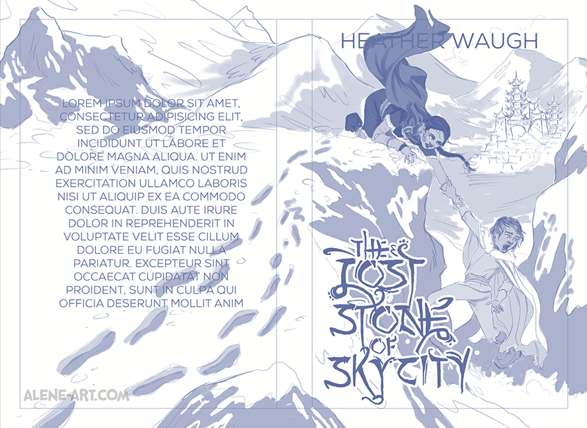
You might notice I have a LOT of bleed (the space around the edge of the cover itself, which is here marked by the thin line border. It's always necessary to have some bleed (3mm is generally standard) for any illustration that is going to 'bleed' off the edge of the page, otherwise a misfired trim might result in an unsightly white edge... but on several occasions I've done an illustration for a paperback cover that has then unexpectedly become a hardback cover. You need a lot more bleed for hardback, so these days, rather than stress myself out painstakingly extending an illustration if I find I need to adjust a cover for hardback, I just design for hardback to start with. If it's not necessary, fine, but if it turns out it is... that's a lot less stress for me!
And then, once that was signed off on, it was time to work on the final! Here's a progress animation:

I designed the title text as well. The setting of the story is a fantasy landscape inspired by Tibet and Peru, so I tried to incorporate the design motifs of those cultures into the text (plus it was too much to pass up that the O, almost in the middle of the title, was the perfect shape for the Lost Stone itself!). It went through a couple of iterations to make sure it was fully legible, and I also did the lettering for the three section headings within the book - Dirt, Ice and Dragon.

And finally, here's a look at the finished cover without the text:

No comments:
Post a Comment