Sunday, June 25, 2017

The Little Mermaid's Transformation

Here's a portfolio piece I did recently, as part of a small series of Little Mermaid illustrations I've been doing on and off. Currently two of them are finished. 


This is the scene where the Little Mermaid drinks the Sea Witch's potion, and grows legs. You can see the jar the potion was in floating away, after she drops it in the sea. 

I really wanted to have this image with the mermaid half in and half out of the sea - we can see the two worlds here, with the waterline as a barrier between them, as this part of the story is really about the Little Mermaid leaving one world and entering another. 

Here's a progress animation:


Adobe Photoshop CC2017 on a Wacom Cintiq Companion 2. 15-18 hours. 

Monday, June 19, 2017

Ocean Views

Still busy, so to save time on my Colour Collective I revisited one of my Mermay sketches and turned it into something colourful. The prompt was 'Apple Green'


I didn't want to go with the obvious connotations of 'apple green', so I chose to use it as greenery. I looked up scenery in Vietnam, and used that as my base, as my mermaid has a conical hat and it makes sense to put her in the right region. Plus, if I was a mermaid, I think this would be good scenery to be sitting around! 

Here's the original sketch:


I flipped the image around for CC, as I decided I liked it when I flipped it to check that everything looked okay. 

I did this pretty quickly, in about three or so hours, including the initial sketch. Lots of use of the dry gritty gouache brush in Photoshop, and not being too bothered about the fine details.

Adobe Photoshop CC2017 on a Wacom Cintiq Companion 2

Sunday, June 11, 2017

Illustrator Tips: Preparing your digital canvas

I often jump into conversations on twitter to help people asking for advice with illustration, so I thought I should start a little blog series dealing with some of the things I often see asked, or that I think might be useful.

So here goes:

#1. Preparing your digital canvas


When designing for print, it's important to know what specifications you are working to before you start. I can't stress this enough - a lot of clients won't automatically provide you with all the relevant information, and possibly won't see the necessity, but believe me, you'll save a lot of stress by getting this information out of them at the start. Ask! Keep asking! Explain to them that if you have to spend ages reworking pieces that end up the wrong size, it will increase their costs. 

For example, here is the cover for Feral Fergus. I had to create the cover long before starting on the book itself, for promotion purposes, and when I did (back in September) the book was to be printed in A4. But this changed to 8x10". No big deal in this case, but just look at all that white space down the sides of the cover on the left. I had to carefully paint in this area back in as seamlessly as I could, and think how difficult this could be if you have a really detailed background and a composition that won't stand for the alteration anyway! You can't avoid all such incidences, but it's best to at least attempt to make sure it doesn't happen.


Continue reading below the cut:


Saturday, June 10, 2017

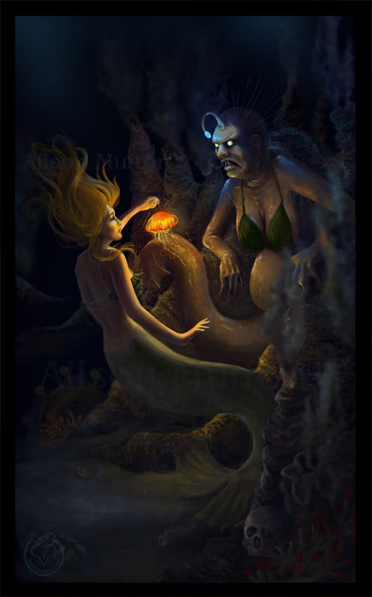
The Sea Witch

Here's a piece I redid for my children's illustration portfolio.


It was originally a realistic digital painting done way back in 2011. It was mainly to prove to myself that I could create something dark and scary, as with almost everything we were supposed to do at uni. I'm not really a dark and scary person, so I always struggled with that a bit, and wanted to see if I could create something scary off my own bat, a couple of years after I left uni. 

Here's the original. There's no place in my portfolio for anything like this now, so I took the concept and turned it into a children's illustration. I quite like redoing old pieces, if I think the concept is strong enough. It lets me see how much I've progressed, and also gives me a chance to fix all those little things that end up bothering me after I've finished a piece. 


Of course, turning it into a children's illustration meant that I no longer had to make it super-scary, which is much more my cup of tea. =P 

Here's a progress animation:


What do you think? Which version do you prefer?

Adobe Photoshop CC2016 on a Wacom Cintiq Companion 2. About 12-15 hours, I think.


Tuesday, June 6, 2017

Mariella

Here's a sort-of-new piece for my portfolio. It's a redo of a piece I did back in 2015 - essentially the same piece, but it's been entirely redrawn so it can stay in my portfolio without bringing down the tone.


It's intended as a book cover, so as I do a lot of work for self-publishers, I added text. This is a roll-over view option on my website. I know conventional wisdom is not to put text on book cover design, because illustrators are not graphic designers... but I do actually have a degree in graphic design. Anyway, self-publishers need to be able to see that I can add text without turning everything into a dog's breakfast.


If I was printing this, I can see spot varnish on the text, maybe even a foil.... but I'm not printing it, so you'll just have to use your imagination.
This has my name on it because it's my story. I've even written some of it!

Find out lots more about this illustration below the cut:

Sunday, June 4, 2017

Meaningful Conversation

Baker Miller Pink for Colour Collective! This pink was developed through studies to reduce stress and aggravation - a fascinating history for a colour, and it was really quite a shame that I'd had a really good day and was in really good mood anyway while working on this. What a waste! =P 


It being MerMay on social media, whenever I hadn't had a topic in mind for my bedtime sketches I'd been doing mermaids. The idea is actually to post a mermaid a day, but I don't have time for that. However, mermaids are nice and girly and all the work I am doing at the moment really isn't, so they're great for a bit of a wind-down in the evenings! This piece was based on this very very quick sketch I did earlier in the week:


I'd just finished off the book dummy for Sioban Timmer's Feral Fergus, which is a fabulous book, but very much gross-boy-themed. So it was fun to just go all-out super girly with this. Pink! And more pink! And Mermaids! And pearls! 

Here are some other (super-quick and messy) sketches I did on the Mermaid theme during may:


More below the cut:

LinkWithin

Related Posts Plugin for WordPress, Blogger...