Showing posts with label coloured pencil. Show all posts

Wednesday, May 3, 2017

Alastair: 12-month Portrait

I keep thinking I have blogged this, and it appears I haven't, so I must rectify that! If you follow me on social media you will have seen snippets of this piece some months back; it's a piece I did for a friend's birthday in July. Her son, Alastair, was also born in July, just a week after her birthday, so it seemed like an excellent time to give her a 12-month portrait of his first 12 months of life. I was inspired by her remarking that he changed so much from day to day. I enlisted the help of her mother, who made sure I had a selection of nice photos for every month. Babies are so expressive, I had fun choosing lots of different moods! 


The painting is just under A3 in size, so each individual portrait is quite small:


I took a number of timelapse videos while I was working. All of them were shared after I had finished the painting and given it away, so that it was a complete surprise.


These last two timelapses are two parts of the same painting. The limit for a timelapse is 10 minutes, so I couldn't fit a whole painting into one. As it was, I always started with the base skin tones already down and dry - no one wants to watch a timelapse of paint drying!


Each individual portrait took in the region of 40 to 60 minutes to sketch and paint, so we're looking at somewhere in the region of 8 to 12 hours for the whole piece. I sketched each portrait out in pencil first, and then it's almost entirely watercolour, apart from a few coloured pencil touches, mainly in the background. I'm really a mixed-media girl. 
I decided to keep the focus on the face by making all of his clothes white - in reality he has a varied wardrobe, but that made everything rather messy when 12 pictures and placed side-by-side.

Winsor and Newton watercolours and series 7 brushes, with Prismacolor pencils, on Moleskine watercolour paper.

This makes a great gift for a mother in your life (or for yourself), so if you'd like to commission something similar, please contact me via my website - I'd love to discuss it with you!

Sunday, November 6, 2016

Baby Cards

Babies always seem to come in clusters, don't they? Here are two baby cards I've completed recently:

This one is for Jemima:


I did the illustration in ink with watercolour highlights so it could count towards Inktober (at which I am woefully behind) as well:


And this one is for Xavier. I had a photo of him to work from, so did a miniature watercolour portrait for this card:


Here's a video I took of me painting this little portrait:


Saturday, September 24, 2016

Benji

Recently I've been doing quite a few pet portraits - which is fine by me, pet portraits are always fun!

Here is one of them - Benji the Boston Terrier. Isn't he gorgeous?


I do my pet portraits in mixed media, I just find that easier when I'm dealing with lots of fur, I can add extra texture easily, and, more importantly, quickly. This keeps the time I spend, and therefore the prices, down, for my clients. 

I took a lot of photos, sharing my progress on Instagram so that my client (who uses Instagram) could see my progress regularly. Some of my process shots were shared in my Instagram Story - so if you follow me on Instagram, check out my Story posts to see extra sneak peeks and progress shots that don't make it into my gallery!


Starting the inking. I'm using Copic Multiliners in 0.1 and 0.05:


This is my least-favourite part of any pet portrait. Animals look really weird without their eyes and noses shaded, and I'm always terrified that it's going to look awful and I'll have to start all over again:


That's better! Eyes and nose to start!


First pass with the watercolour. I'm using Ecoline in black for the main areas, because it's nice and black, and then using Winsor & Newton watercolours on top:


Almost finished. After I was done with the watercolour I went in with coloured pencils for a bit more texture and contrast:


And the final product! I had a slight accident right at the end - I opened my jar of Ecoline to do a touch-up, and there was a huge bubble in the top.... which popped and spattered all over my desk. I was frozen in horror for a while, as there were now black spots on my 99.9% completed pet portrait. Black spots in Ecoline, which has never even heard of 'erasing'. (I'm sure everyone who works traditionally has moments like this. If you're working digitally, I think the best parallel is accidentally pressing 'Do Not Save'. Aaaaarrrrg!!). PSA: If you're using Ecoline and it gets a bubble, rescue your work before it pops!

When I'd stopped hyperventilating, I came up with a solution. Necessity is the mother of invention, and all that. I was already planning on spattering some coloured watercolour, as in this portrait card, so I used my Copic Multiliners to add extra black spatters (somehow I don't trust myself to just fling black ecoline at a painting, even if I can do so with watercolour). The accidental spatters had somehow miraculously missed landing actually on Benji. I think the effect is none too bad, even if it isn't exactly what I originally planned. What do you think?


Can't get enough of Benji? He has his own Instagram!

Copic Multiliners, Ecoline Ink, Prismacolour pencils and Winsor & Newton watercolours on Moleskine watercolour paper. Just under A4 in size. This portrait took 4.5 hours. 

Thursday, April 14, 2016

Oscar

I was recently commissioned to do a memorial portrait of a schnauzer that had died unexpectedly. The commissioners were friends of the owners, and I thought it was a lovely thing to do. 

Here is the final portrait:


Initially I was asked to surround Oscar with flowers, but before I'd got started on rough sketches I was told that he spent a lot of time at the beach, and that that would be a better setting. I did three rough concepts to start with, two of which included coastal vegetation, and the one they chose, with him looking out to sea. I've worked with this client before, and she knows that my hideous rough sketches will eventually become better, so the initial concepts were very rough.

Here's how the piece progressed. Rough sketch (Photoshop) > More refined sketch & colour study (photoshop) > inking (Copic Multiliners) > Painting (Watercolour & Coloured Pencil)


Winsor & Newton Watercolours, Prismacolour Pencils, Reeves Gouache, Copic Opaque White and Copic Multiliners on Moleskine watercolour paper.

Monday, February 15, 2016

Portrait: Cat & Ashby

In December I was commissioned to do a couple portrait in coloured pencil. I started right away, but only finished a few days ago - not because I was lazy, but I had a lot of other work on, so the projects with the closest deadlines were completed first. It's a juggling act! =P


It's quite some time since I did a portrait (or anything, really) in coloured pencil (I think it's about five years!), so this was a lot of fun. It's a medium I used to use a lot more, but which fell by the wayside a bit for the joint reasons of my hurting my drawing wrist (back in 2008) and learning how to use watercolour properly so that I no longer had to rely on mixed media. My coloured pencil method has changed somewhat since I hurt my wrist - lots of soft layers instead of hard colouring - so that I can use them without ill-effect. This means things look a bit fuzzier close-up, but from a normal viewing distance I think the effect is actually much better than my old technique. 

Here's a progress animation so you can see how this came together. Note how I was struggling with the likenesses for a while, and was making lots of small changes. Coloured pencil is much more nerve-wracking than graphite when it comes to likenesses, because it's so much harder to make corrections! 


Prismacolor pencils on Quill Drawing Cartridge paper. About 20-25 hours.

Thursday, October 29, 2015

Illustration: The Quest


Over the last few weeks I have taken part in Giuseppe Castellano's Illustration Department 3-Week Illustration Workshop. There aren't as many opportunities for workshops and the like here in Perth, and I was feeling a bit like I was working in a bubble - it was time to get some new feedback on my work and push myself to explore in different directions. Giuseppe's online course was perfect, slotting very nicely into a slow period of work and finishing just as work picked up again. 

In the first video conference Giuseppe went through my portfolio website, identifying pieces that worked the best and areas that needed work. He then gave me an assignment. He had flagged my heavy use of black outline in a lot of my work, and wanted to see me using a looser, non-black line, and also to tone down my colours a bit. 

My assignment was as follows:

Create a traditional piece, 8x10", subject matter open but using line that is not black and not 'outline' and a dead colour palette. 

He also suggested I look at Tony Diterlizzi and Arthur Rackham.  

The first few days after I got the assignment I was too busy to start. I had some artworks to complete, and it was also the weekend of the Kelmscott Annual Show and I spent the entirety of Saturday demonstrating portraiture and needle felting in the exhibition hall. However, I used that time to plan out my illustration in my head, sort of mentally thumbnailing. 

Lots of people, I hear, choose to redo an exiting portfolio piece with their assignments, but instead I decided to do something with a sketch that was sitting in my sketchbook, and that I thought had potential. I knew what I wanted to do with it would be difficult, so I wanted a reason to actually get started, do my best with it, and finish it.


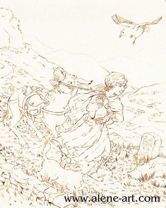
I'd picked up The Islands of Chaldea, Diana Wynne Jones' last book, in the bookshop, and sketched this while I was reading it. It was a bedtime sketch, so not particularly imaginative in terms of layout or anything, just a rough sketch based around a scene in the book.

For my assignment I didn't actually want to illustrate The Islands of Chaldea, but I thought the basic idea of a donkey that didn't want to go was a good starting point, especially as it had been suggested that I look at Tony Diterlizzi's work. To actually be an illustration for The Islands of Chaldea the girl would have to have brown hair, the raven would be a parrot, the donkey would be pulling a cart, there would be several other people and the dog would be a magical cat. 

Here is the rough thumbnail I did before I started sketching, just to check that the basic concept I had planned in my head over the previous few days worked:


I then did a rough digital sketch based around that thumbnail:


I kept each part in a different colour so that I could see what was what. Sketching can get messy and it's so easy to get lost in a mass of linework. 

I then did a refined draft linework, still digital:


As you can see, I flipped the image. Images read best left to right, but being right-handed I draw best in the other direction. Why fight it when I'm working digitally and can easily flip once the difficult bits are drawn? I also altered the donkey's expression quite a lot, to make sure it was very clearly not happy.

I had planned the image with a diagonal cut across the composition, as Arthur Rackham had been mentioned in our first conversation. I did my honours thesis on Golden Age Illustrators, with a fairly heavy focus on Rackham and Dulac, so as a bit of a nod to him I utilised I popular Golden Age compositional trick, where the composition is cut diagonally, with most of the action happening in the bottom half. This was originally inspired by Japanese woodcut compositions, after the trade borders opened up in the 1870s and it's a composition I rather like.

All these images are from my Golden Age Illustration Pinterest board. Head over there if you would like to see them bigger.

Finally I did a colour study. Not only was I going to be using a colour scheme that wasn't my usual one, but a lot of the parameters for my assignment had to do with colour and linework - none of which come across on a digital draft!


I sent this, and the draft linework, off. Giuseppe was generally happy with it, his only concern being that the raven was the only dark part of the image and threw the balance off. He suggested I darken the tones in the foreground to fix this, and gave me the go-ahead to start on the final.

Before I could start on the final, however, I had to get some ink. Easier said than done in Western Australia! I went to my local art shop, wanting waterproof ink in any dark colour that wasn't black - sepia, dark grey, paynes grey, I wasn't choosy, but the shop wasn't very helpful. In the end I managed to snag some FW Acrylic Artists Ink in Burnt Umber. It's only water resistant, not waterproof, so if I was really working the watercolour in some areas it got a bit lost and I had to go back in and touch up, but overall I think it worked well. I also bought a cheap 2/0 sable brush so that I didn't kill my expensive brushes with the ink.


Having completed the inking it was time to paint. These are the materials I used:


The red tones were used the least. I researched dead palettes before I started, and a lot of the info stressed the need for one spot of bright, saturated colour. In my case it was the hair of my girl character. I used Cadmium Scarlet and Winsor Orange for her hair, and some Rose Dorè on her skin. Indian Red added the lowlights in her hair, and was also used on some of the browns elsewhere in the image, so that the red tones were spread just a little. 
It's almost entirely watercolour, but I did get out my coloured pencils at the very end, just to darken some of the shadows and add some extra leafiness to the vegetation in the foreground, and also darkened a couple of lines with a sepia PITT Artist's Pen (not shown). 


I sent the above image off to Giuseppe and we discussed it during my final conference. 

He was happy with it, and especially pleased with my use of leading lines (in the pathway and the river) and my treatment of the fabric and the figures, but flagged a few places where it could be improved:

The sky was a bit too busy
The figures didn't stand out from the background enough
The dog got lost

I agreed with everything he pointed out, so after our meeting I took the painting into Photoshop and made some adjustments:


What do you think? An improvement? 

The sketch, being a complicated one where I was trying new things (especially with the donkey) took about 9 hours, I think, and it took another 14-18 to paint it, although there were some pauses in there while I waited for paint to dry.

Wednesday, October 28, 2015

Portrait: Myrna

I did this little portrait sample as another item to enter in the Kelmscott Annual Show. I was entering in the 'drawing' section, so I stuck almost entirely to coloured pencil, although normally I would have done watercolour underneath (especially for the background, that would have sped it up considerably!) as I am generally happier with mixed media for pieces like this. 

This is my dog Myrna. She's a cavoodle. I love her, she's gorgeous, and she knows it full well. I took the photo I used for reference a few months ago, when she was living up to her film star namesake (Myrna Loy) especially well.  


Most of this is Prismacolour coloured pencils, with just a tiny touch of Copic Opaque White and a Copic Multiliner for her whiskers - it made much more sense to add them after the rest of the portrait was finished!

Here are a couple of in-progress shots that I posted to Instagram and Twitter. Links to my social media platforms are in the sidebar. 


I do pet portrait commissions, please contact me via my website if you would like to discuss a pet portrait or any other illustration or portraiture project. 

Sunday, December 18, 2011

Portrait: Tilly & Ashby

A smallish coloured pencil portrait done for my friend's parents as a joint Christmas and 25th Wedding Anniversary present. It's from a truly beautiful photograph my friend Tilly's father took of her and her brother on her wedding day. It wasn't quite as sunny, Tilly was in shadow, and there was very harsh light on Ashby's cheek, so I improvised with the lighting, and I think it came out rather nicely. It's nice to be able to alter what's in the photograph (beautiful though it may be) so that the portrait is different. Some things you can't do with Photoshop. =P 
They opened it before they went on holiday, and seemed to really like it, which always makes me happy. =)


It's a bit looser than some of my other portraits, mainly because although I started several months ago, I didn't have enough time to spend 40+ hours on it. =( It probably took somewhere around 20 hours, perhaps a bit less. 

Prismacolour pencils on bristol board, 18cm diameter. 

Monday, September 5, 2011

Illustration: Wonder

This was a commission for my Great Aunt. She lives in a nursing home in a country town, and was brought an enormous Mr Lincoln rose – a small boy was completely amazed by it, and she was very taken by his expression. So she wanted two pictures, identical (which makes one feel rather as though one is regarded as a Xerox machine). I think one is to go to the boy's mother, and the other to his grandmother. 

However, there was a slight problem: I have never seen this little boy, I had no reference photo, and only the information that he was about three, sturdy, and blond. In addition, while I can render a photo very accurately, my illustration style is completely different, and who knows if the recipients will appreciate such pictures – of a small boy that probably looks nothing like the one in question? His expression is probably nothing like the original either, but I'm afraid I can't help that. 
But one does not argue with 92 year old ladies. 

So here we have the two images, as close to identical as I can get them.


I actually ended up doing two and a half pictures – I was halfway through painting the first one when I realised that I'd given him five fingers. Arrg! I'd never done that before, and no one picked up on it when I was begging to be told if the sketch looked okay – so I just had to start all over.

The rose was painted in Ecoline, which never scans at all well. Here's a photo which shows the nuances of colour slightly more effectively.


Artline Drawing System pens (0.1 and 0.4), Winsor and Newton watercolours, Ecoline liquid watercolours, Prismacolour pencils.

Friday, June 10, 2011

Illustration: Much Ado About Nothing

This is not a new illustration, rather, it's from June 2009. I'm in the process of updating my website, and this has lost its place in my official colour portfolio so that the number of pictures is kept to a manageable size. But I still like it, and it's not posted anywhere else, so I thought I'd blog it. 

It's an illustration for Act 3 Scene 1 of Much Ado About Nothing, which is one of my favourite of Shakespeare's plays. Hero and Ursula are gossiping especially so that Beatrice can overhear them.

"Then go we near her, that her ear lose nothing of the false sweet bait that we lay for it – No, truly, Ursula, she is too disdainful."

I liked my original sketch for this better than the finished piece; I love the colours, but the characters lost something during the inking phase.

And here's a companion piece for Act 2 Scene 1, which is remaining in my black and white portfolio for now. But they do go together, so I'm adding it to the post. This time it's witty banter at the party:

"Will you have me, my lady?"
"No, my Lord, unless I might have another for working-days; Your grace is too costly to wear every day."

Two years before I did these pieces, I'd done a set of four posters on Shakespearean quotes for an educational publisher. Most of them were modern in theme, and they were very text-heavy, which was challenging. I think I ended up doing these illustrations more so I could have a chance to do Shakespearean pictures with proper costumes (and to prove that I understood the plays well enough for illustration purposes) than anything. 

Act 3 was inked on bristol board with sepia ink and a dip pen, and painted with Winsor & Newton watercolours and Prismacolour pencils.
Act 2 is graphite on Quill sketching paper. 

Monday, March 21, 2011

Fred

I actually finished Fred last week, and he was collected on Wednesday – I just haven't got round to posting him until now. 

I'm happy to say the commissioner was very happy with the result; I hope the person this is intended for will like it as much. =) 

I enjoyed doing this portrait – most of it was very relaxing, just colouring in! =P Since my last posting, I finished off the coloured pencil work, and added considerably to the inking. I also added a white spot on colour-Fred's eye; not quite true to the Franz Marc style, but it made him look much more alive. 
The abstract squares were a little challenging, as I've never done anything like them before, but once I worked out what I was doing, I think they worked quite well. I based them on Marc's Piggies (no idea of the date) because they added a bit of the abstract qualities of Marc's later work without being too overpowering of the linework, or being too difficult for me to execute (with a view to the facts that I have never been very good at abstracting things, and I was using coloured pencil, not paint.) 

All things considered, I'm pretty pleased with this. I hope you like it! 


Winsor & Newton and Reeves watercolours and Prismacolour pencils, Carbon Black Atelier waterproof drawing ink on Bristol Board. 

About 23 hours.

Previous Fred Posts:

Wednesday, March 9, 2011

Progress: Fred 2

Moving right along!

Further progress on Fred, who I think is coming along quite nicely.


Winsor & Newton and Reeves watercolours and Prismacolour pencils, Carbon Black Atelier waterproof drawing ink on Bristol Board. 
About 11.25 hours so far.


Previous Fred Posts: 
Franz Marc Studies
Progress 1

Tuesday, March 8, 2011

Progress: Fred

This is the project that those Franz Marc studies were for. I'm moving a little more slowly with this than I would like – it just hasn't been my week. I was down with a cold, bounced back for an unexpectedly social weekend, and then went down with a 36 hour migraine. These things I could seriously do without!
However, progress has been made, so I thought I'd post some pics:

Here's the final approved outline-and-colour study. I don't often have such detailed colour studies, but since this is as unfamiliar style, I wanted to get all my experimenting done in Photoshop, and give myself a detailed guide for the final piece.


I chose to put a detailed ink-work portrait of Fred The Horse on the right, as it's not really possible to draw any one specific horse in Franz Marc's style and this is supposed to be a portrait of Fred. I based the pose of the background Fred on one of the horses in Marc's 1911 painting The Large Red Horses, to get a properly Marc-like feel.


For those interested in the hideous-ness of my thumbnails, this was the original concept. 

The Stages So Far:

I removed the colour layers from my study and printed out the linework on two pieces of A4 (after first altering the position of the background horse's legs, which were bothering me) paper to give me a ~35 x 22cm copy to trace, and cut out an appropriately sized piece of Bristol Board.


Traced the outlines using my lightbox, and then refined them.


Completed most of the inking (until I got tired with it, and decided to play around with some colour for a while =P) with Carbon Black Atelier waterproof drawing ink, a small brush, and a dip pen. 


And started adding the first of the colour.


What you see here is a combination of Winsor & Newton and Reeves watercolours and Prismacolour pencils. 

About 7.5 hour so far.

LinkWithin

Related Posts Plugin for WordPress, Blogger...