Gracious, 202 has been a crazy year! I've actually been working fairly solidly, for which I am extremely grateful... but somehow this blog got lost. In an effort to prevent it from languishing completely, let's have a quick new post!
This is my latest Colour Collective post. If in doubt, draw a cat, I say! The colour was 'dark terracotta', which is not a favourite of mine, so I knew I wanted to make it pop with some nice clear blue. And the nasturtiums are in flower in our garden so I thought they'd be a nice addition. The rest of the foliage is shamelessly swiped from a current work project. I have been drawing a lot of leaves and jungle backgrounds so I just popped some of those in here to keep it speedy (I wanted a bit of illustration R&R with my Colour Collective, but I didn't want to spend too long because deadlines. This took 3, maybe 3.5 hours (hard to gauge when you were watching tv at the same time!)
I did this in Adobe Fresco, so there's a time-lapse. I posted it on Instagram, so I'll embed the post here. Click through to the second image to see it.
Here's a memorial pet portrait I recently created. His name is Amigo, and I was told he loved the beach. It was commissioned by a friend of his owners, as a surprise, so I only had a few facebook photos to go off - not the best situation; I had four photos, he was lying down in all of them, and I could only see his body in one of them. However, he was a nice plain-coloured Labrador, so that made it easier, any old Labrador-body would do. It's when dogs have specific patterns that I don't know about that we run into problems! (PSA: 'Illustrator' is not synonymous with 'Clairvoyant' ^.~)
Colour Collective's 'Boto Pink' prompt came along when I was completely snowed under with deadlines (14 illustrations in 5 days, anyone?). But I don't like to miss CC, and I also didn't want to miss posting something for Chinese New Year... so I took an old Myrna illustration I did for Colour Collective some time back, and updated it (very quickly) to suit both themes. Under the circumstances, it was the best I could do!
Adobe Photoshop CC2018 on a Wacom Mobile Studio Pro
Every year I do custom Christmas cards for some lovely friends. We started in 2013, when they had just got their first dog, so she was the subject of the cards. In 2014 they had a second dog, so I added her in, and by 2015 they had a gorgeous little boy, who naturally had to be included too! This year marks the 5th year of this card series, their little boy is now two and a half, and most of their card recipients have now tumbled to the fact that these are custom commissioned cards, they aren't just super-good at finding cards with dogs that look like theirs!
Back when they only had dogs, I used to do two separate designs for them, but now I just do one, with a traditional Christmassy red-green-gold colour scheme, and another with a blue-gold-grey colour scheme. Here's that second colourway:
You'll notice that the icecream in this one doesn't match the rest of the colours - that's because strawberry icecream is his favourite and we wanted to feature that. The red card has a choc-mint icecream, (because strawberry doesn't match red) and let me tell you, I got very hungry while painting it!
We got them printed at Moo, and they of course did a wonderful job:
These were done in Adobe Photoshop cc 2018 on a Wacom Mobile Studio Pro.
Go below the cut to see all the previous years' cards:
A slightly more polished Colour Collective, from after the deadlines had been met. This was the last CC before Christmas, so I definitely had to continue my Christmassy themes. I chose to do Myrna again. She doesn't, fortunately, eat the baubles off the tree (or the presents), but it's a good image.
I used this for my thank you cards this year. It's good to find multiple uses for something!
Adobe Photoshop CC 2018 on a Wacom Mobile Studio Pro. It took about three hours or so.
I was short on time for Colour Collective's 'Fiery Coral' prompt, so I needed something quick and easy. On the day before I'd uploaded one of my Myrna series to Instagram as a Throwback Thursday post, and people seemed to like it, so I went with a Myrna theme for Colour Collective too.
It was such a bright, cheerful colour, it made me think of smoked salmon and watermelon, so here is Myrna in stealth mode, seeing if she can steal some lunch.
In reality she's more likely to steal your serviette - she's addicted to tissues - but that had already been a subject in one of my Christmas Myrna illustrations last year. =P It's quite common, however, to see Myrna's head just rising over the edge of a table, to see if there's anything good there. Our previous dog was about half as tall, long and heavy, so it's a bit of a shock to have a dog that can so easily reach the table! (we've had Myrna 4 years now, but that doesn't outweigh the complaisance of 17.5 years with a tiny terrier!)
Adobe Photoshop CC2017 on a Wacom Cintiq Companion 2. 1.5 to 2 hours
A new Christmas card to add to the lineup for some lovely friends. I've been doing their cards since 2013 and they have evolved from one finnish lapphund, to two finnish lapphunds, to the addition of a baby. Said baby is now a cheeky toddler, and I thought it was about time he got up to some Christmas Card mischief!
The original sketch for this was a little different - I initially had the two dogs joining in with painting the wall, but it was decided that as they are generally more placid and long-suffering than they are naughty it would be better to reflect that. Here are the two sketches side by side. I switched orientation as I felt it worked better.
Here's a progress animation:
Of course, I used reference photos (these cards are, after all, a slightly more arty equivalent of family-photo cards - they have to look accurate!), and I also used some free finger-paint brushes for the Christmas tree. I'm pretty sure they were these ones. The nappy cover is inspired by the many wonderful ones he's regularly dressed in. I couldn't leave it plain when he always has such stylish ones!
I did two colour-ways, as usual, as we get them printed at Moo, and it's nice to take advantage of the printfinity option. Back when it was only dogs I used to do two different designs, but lately it's just been different colours.
Here's the whole line-up of cards. I always keep to roughly the same look. I've linked to the corresponding blog posts if you want to read more about any of these:
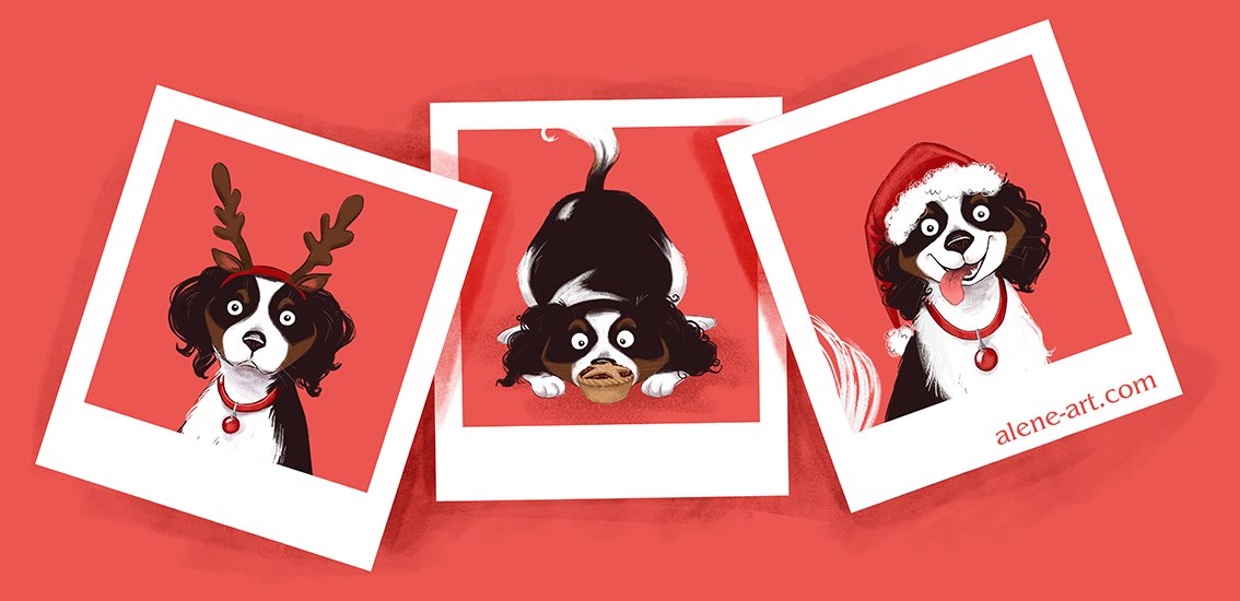
Here's my Colour Collective for last week. The colour, seasonably, was 'Scarlet'. I'd had good feedback on my Myrna pictures at the Expo I attended last week so I thought I'd do some more in that series. I'd been asked if I had any greeting cards of the series, and I thought I should make some up - and some seasonal ones would be a good addition to a range like that!
Here's the image I made for Colour Collective:
I'd done three full-body pictures, but cropped them down for this piece. I also posted one of the full pieces as a second Colour Collective entry. The other two I plan to use for Illo Advent later in the month (when things get busier, as I know they will, and I don't have time to create something every day. I'm hoping to manage the first 12 Days of Christmas with new pieces, and then switch to a combination of existing pieces and one-off illustrations, rather than a series. I'll blog about my Illo Advent pieces once I'm done. I'd love to add some more Christmas Myrnas, but we'll see how I go).
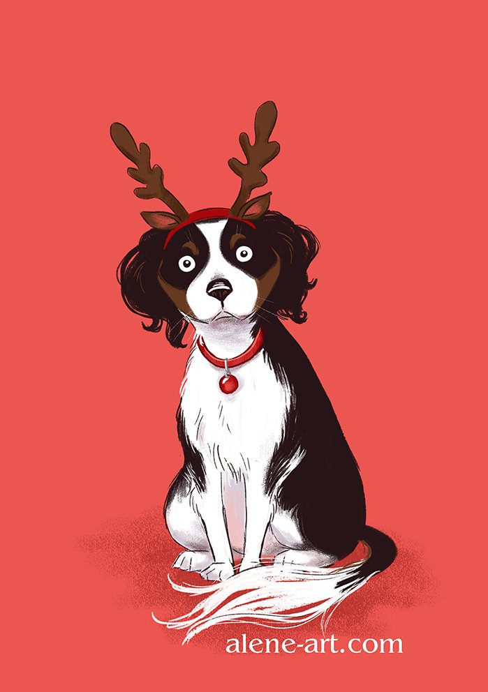
Here's the full piece of Myrna, unamused, in antlers:
Here's the photo that inspired this piece. It was taken last year, and even bribed with treats off-camera Myrna wasn't too happy about being put in antlers!
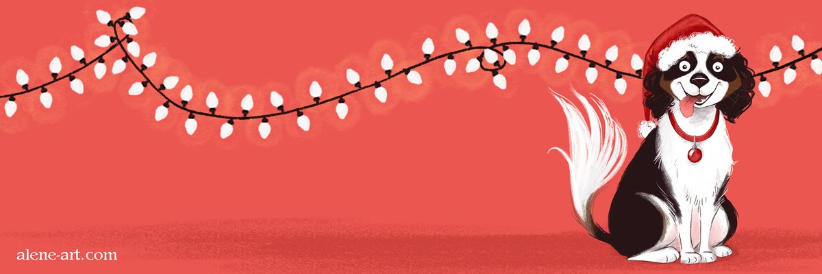
I also used one of my Myrnas to create a quick seasonal Twitter header. I realise I should change my header more often (it has been The Princess and the Pea since I set up my account several years ago. Oops!) and thought I should make a start with a Christmassy header (that I will have to change again at the end of the month. Start as you mean to go on, and all that.)
Adobe Photoshop CC 2015 on a Wacom Cintiq Companion 2. I suppose each Myrna took about an hour to an hour and a half to do, with a further half-hour to combine them into the snaps image. They were all created using Kyle Webster's China Marker and Gouache a Go Go brushes (two of my favourites), with the glow from the fairy lights created using his Big Watercolour Texture brush.
Here's another recently-completed pet portrait, this time of Dez the staffy, who has unfortunately shuffled off this mortal coil.
Here's my process, told mainly through photos taken with my phone and shared to my Instagram Story:
The commissioner had seen my Miss Bear portrait, and wanted a similar floral background. As Dez is such a black dog, I didn't think it would be sensible to have a black and white floral behind him, so we decided on green. I started off my sketching everything out in Photoshop. I didn't have a lot of photos to work from, but I combined several to get the best possible pose and expression. I sent this sketch to the commissioner to get her approval to move on before I started inking:
And then traced it onto Moleskine watercolour paper using Copic Multiliners. It was at this point that I added his tail. You couldn't see it in the photo I was using for his body pose, but I came to the conclusion that it looked a bit weird without any tail visible at all:
Once everything was inked, I started off by painting in the background in several shades of green watercolour:
And then at last it was time to paint Dez himself. It can be a bit unnerving, being stared at by a dog who's nose and eyes are not filled in!
It takes quite a few passes with the black Ecoline to get a really solidly black dog. There are about three layers of Ecoline, plus coloured pencil, all over Dez:
I added gilding as with Miss Bear, which really helped to warm everything up:
I sent a photo of the finished portrait to the commissioner, who expressed concerns that Dez wasn't black enough (the pitfalls of working from smartphone photography, you're never quite sure how realistic the colours are, and I'd erred more on the brindle side. However, that's what progress shots are for, no harm done)
So before she came and picked it up, I went over him again with black coloured pencil, and pushed the blacks as hard as I could without losing all sense of his shiny fur and the underlying muscles that a staffy has. I sent her another photo to check that she was happy once I'd done that:
Copic Multiliners, Winsor and Newton watercolours, Prismacolour pencils, Copic White and Cosmic Shimmer gilding flakes on Moleskine watercolour paper. 8 hours in total.
Here's another recently-completed pet-portrait - this time of a cat! I don't do many cats, my pet portraits tend to be a long line of dogs.
Miss Bear is a beautiful siamese. I was given a few photos to choose from, and chose a pose where she was sitting up straight and proud, as befits a siamese cat:
The background went through a couple of iterations. Apparently she likes to sit by the fire, and so the commissioner (who was commissioning a present for the friend than owns (or is that 'is owned by'?) Miss Bear) originally wanted her sitting on a hearth in front of a roaring fire.
Fire is pretty revolting to paint, so I wasn't exactly looking forward to that, but I was fully prepared to give her a cosy fire... and then I learned that the recipient is red-green colourblind. I did a bit of checking to find out exactly how red-green colourblind people see the world, and found that red appears, basically, yellow. This didn't bode well for painting a fire, where I would be exclusively using red, orange and yellow. I just didn't feel confident that I could paint a convincing fire that would work for a colourblind person, so I contacted the commissioner and suggested a different option - a black and white floral background inspired by the designs of William Morris - lots of nice contrast that would work well for a colourblind person, with a bit of gilding added in to catch the light and liven everything up. Siamese cats are so graphic themselves that I thought the background would work well. The commissioner liked that idea, so I went with that.
Here I'll collate some of the progress snaps I shared on Instagram, and my Instagram Story, as I worked:
I did the draft in Photoshop, on my Cintiq Companion 2 - it just made it much easier to work out the pattern, and repeat areas, without constantly worrying that I was filling in the wrong thing or drawing lines in the wrong place:
I printed out my digital draft and used my lightbox to trace it onto Moleskine Watercolour paper using Copic Multiliners:
Eventually I had everything inked:
I filled in the background with black Ecoline, while Miss Bear herself was painted in Winsor and Newton watercolours with details added in Prismacolour pencil:
The final stage was to add some gilding. I used Cosmic Shimmer Gilding Flakes in Autumn Leaves. This photo shows just how shiny the gilding flakes are:
Here's a video I took to show how I applied the gilding:
Finally, I created 15 greeting cards using the painting. They were too small to use this gilding technique, so I went over all the gilded areas with different coloured metallic gel pens - not as shiny, but better than nothing.
Copic Multiliners, Winsor and Newton watercolours, Prismacolour pencils and Cosmic Shimmer gilding flakes on Moleskine watercolour paper. Six and a half hours in total (not counting the cards).
Recently I've been doing quite a few pet portraits - which is fine by me, pet portraits are always fun!
Here is one of them - Benji the Boston Terrier. Isn't he gorgeous?
I do my pet portraits in mixed media, I just find that easier when I'm dealing with lots of fur, I can add extra texture easily, and, more importantly, quickly. This keeps the time I spend, and therefore the prices, down, for my clients.
I took a lot of photos, sharing my progress on Instagram so that my client (who uses Instagram) could see my progress regularly. Some of my process shots were shared in my Instagram Story - so if you follow me on Instagram, check out my Story posts to see extra sneak peeks and progress shots that don't make it into my gallery!
Starting the inking. I'm using Copic Multiliners in 0.1 and 0.05:
This is my least-favourite part of any pet portrait. Animals look really weird without their eyes and noses shaded, and I'm always terrified that it's going to look awful and I'll have to start all over again:
That's better! Eyes and nose to start!
First pass with the watercolour. I'm using Ecoline in black for the main areas, because it's nice and black, and then using Winsor & Newton watercolours on top:
Almost finished. After I was done with the watercolour I went in with coloured pencils for a bit more texture and contrast:
And the final product! I had a slight accident right at the end - I opened my jar of Ecoline to do a touch-up, and there was a huge bubble in the top.... which popped and spattered all over my desk. I was frozen in horror for a while, as there were now black spots on my 99.9% completed pet portrait. Black spots in Ecoline, which has never even heard of 'erasing'. (I'm sure everyone who works traditionally has moments like this. If you're working digitally, I think the best parallel is accidentally pressing 'Do Not Save'. Aaaaarrrrg!!). PSA: If you're using Ecoline and it gets a bubble, rescue your work before it pops!
When I'd stopped hyperventilating, I came up with a solution. Necessity is the mother of invention, and all that. I was already planning on spattering some coloured watercolour, as in this portrait card, so I used my Copic Multiliners to add extra black spatters (somehow I don't trust myself to just fling black ecoline at a painting, even if I can do so with watercolour). The accidental spatters had somehow miraculously missed landing actually on Benji. I think the effect is none too bad, even if it isn't exactly what I originally planned. What do you think?
Copic Multiliners, Ecoline Ink, Prismacolour pencils and Winsor & Newton watercolours on Moleskine watercolour paper. Just under A4 in size. This portrait took 4.5 hours.