Showing posts with label process. Show all posts

Tuesday, October 27, 2020

Book Cover: Story Magic

Last year Jolly Fish Press asked me to do the cover for Story Magic by Laurel Gale. It was such a fun assignment, and to celebrate its publication day, I thought I'd do an epic blog post about how the cover came together, and explain the process of working with a publisher. This was also the first commercial assignment I did working (almost) exclusively in Procreate on my iPad Pro.

Step 1: The Assignment

I was not given the text of Story Magic to read - instead, I was given a brief blurb, and some notes. I was told that the cover should:

- Have a magical vibe
- Have a 'hero's journey' vibe
- Reflect a more traditional middle-grade high fantasy style
- Convey stories or storytelling in some way
- Depict the main character (Kaya)

I was also told that the author liked bold colours, especially green, blue and purple, silhouettes and stylised characters rather than straight realism. 

I was given the following book covers as inspiration:

Extraordinary Birds by Sandy Stark-McGinnis, cut-paper cover art by Hari & Deepti


The Girl Who Drank The Moon by Kelly Barnhill, cover art by Yuta Onoda


I was also given some stock photographs of women the author thought looked a bit like she imagined Kaya to look, and a rough description of her appearance and clothing. 

Finally, I was told that they liked the idea of some sort of embellished drop-capitals in the title text.

To start with, in the original email I was sent, there were two suggested scenes for me to illustrate, but by the time I had the assignment and was given details, this had been reduced to just one:

Kaya has climbed to the top of a large tree and she's looking down on the city of Prima. She looks determined (she's made it through a long journey to save her brother). Per the text: The dopest ended a short distance ahead. Beyond it lay a sprawling city, waves of streets and buildings leading to a giant fortress with towers that soared into the clouds. (...) From her treetop view, Prima had looked enormous and beautiful, filled with colourful houses and towers that touched the clouds.   

Step 2: Designing Kaya

Based on the images and description I had been given, I started to design the character of Kaya. Coupled with the stock photos I had been provided with, I had a description from the author:

'Kaya is slender, scrawny even, with big brown eyes, straight brown hair, a thin nose and olive skin. She wears a dress with long sleeves and a long skirt, often with the blankets she knitted wrapped around as a shawl.'

I did a few sketches of faces, settled on one, and then started to design her costume. I had been told 'traditional high fantasy' but I didn't really know what sort of costumes would suit the world of the book, so I tried a number of different options:


(some of the faces on the right are from my initial sketching. I've combined everything here.)

Then I waited for everyone to get back to me and let me know if I needed to come up with more concepts or not. In this case, I was lucky- they chose costume 1!

Step 3: Rough Concepts

With the go-ahead on the look of Kaya, it was time to start coming up with concepts for the cover itself.


I started with four concepts. The first followed, to the letter, the description I had been given, and then I started to play around with it. For concept 2 I zoomed in for a more intimate illustration, and had Kaya looking over her shoulder, so we could see her face. For concept 3 I sat her in the tree, telling a story to the Listeners, which form a large part of the story. (Books do not feature in the story, all the magic is through the oral telling of stories.). And for concept 4 I turned concept 1 around so we could no longer see the city of Prima, but got a full view of Kaya's determination, framed by the full moon. 

I sent these off, and concept 1 was chosen.

Step 4: The Cover Rough

With a solid direction now in place, it was time to work on the draft of the cover.


Those pink lines are my crop and bleed lines. I always like to add a fair bit of buffer to illustrations that are going to be used as colours, in case the designer decides to reframe or zoom out a bit (or if it is decided to produce a hard-cover copy. I once had to paint in extra illustration on a watercolour cover illustration when it was suddenly decided to produce a hardback book... never again!). So the internal line is the crop line (the dimensions of the cover) and the outer line is a generous bleed allowance. And after that, it's all buffer. In theory, only the portion of the illustration within the internal line would be seen on the final product. 

The placeholder text is a bit ugly - working in Procreate, the text tools are rather basic, so I just put in some rough text to indicate where it would fit.

The city of Prima was complicated, so I worked on that in another Procreate document (partly because it's easier that way, and partly so I didn't have to worry about layer limits. As I work at 400dpi (in case the designer decides to zoom in) I had a 15-layer limit. 


When I'd finished the rough, I did a quick colour study, and sent it off. You'll see here I had taken the image into Photoshop and done some better text. At this point, my suggestion was to give the appearance of embellished drop-capitals with stars (as it had been pointed out the really traditional drop capitals were a bit anachronistic for a story without books.)


Step 5: The Final

Apart from requesting that the Listeners be closer to Kaya, and that the font be less heavy, I was given the go-ahead to start the final. Yay!


I also provided a number of font options, as I couldn't position the stars to embellish the capitals until I knew which font was being used. Here is a selection of the fonts I offered:


(fonts used, clockwise from left: Alana, Cantoni, Memoriam, Harlean).

View this post on Instagram

Here’s the #timelapse of the cover for #StoryMagic, all done in @procreate (it was meant to be added to the last post, but... it’s been a long day...). This is VERY sped-up. The original@from procreate was nearly ten minutes long, and I’ve reduced THAT down to just over thirty seconds. It would be handy if I could draw that fast (although I might get motion sick 🤣) 💜 . . . #kidlitart #kidlitartist #kidlitillustration #kidlitillustrator #bookcover #kidlitcover #middlegradecover #middlegradebooks #jollyfishpress #timelapseart #procreatetimelapse #process #fantasy #illustration #ipadart #timelapseillustration #artforkids #childrensillustrator #childrensillustration #illustratorsoninstagram #illustration

A post shared by Alison Mutton, Illustrator (@alene.art) on

It was then decided that the designer would do the text, and the embellished capitals were ditched. These things happen, but I think it was rather a shame; who doesn't want to draw sparkles?

Here's the final cover 
(Design by Jake Slavik)


Tuesday, October 1, 2019

The Lost Stone of SkyCity

Earlier this year I had the pleasure of illustrating the cover for HM Waugh's debut middle grade adventure, The Lost Stone of SkyCity with Fremantle Press. To celebrate the release of the book today, here's a little look at the process I went through.


See more after the break!


Sunday, March 10, 2019

Baby Cards!

I always like to do special hand painted cards for babies - such a special occasion, it warrants a bit more effort on my part! - and in February we had TWO babies arrive, just over 24 hours apart, so I got out my paints and made these two cards:

The first card was for my friend Tilly, and baby number 2, a daughter - she now has a son and a daughter, plus a husband and two dogs, so they're a perfect little family!

I'd bought the baby presents well ahead of time, just before Christmas - our local toyshop was closing down (nooo!) so we went in and grabbed some bargains - and I'd unintentionally gone all owl-themed. So I thought I'd go for broke and put an owl on the card as well:


The second card was for my eldest cousin Claire, and her third daughter, who arrived the next day. I stuck with flowers for this card. Roses are quick to draw, and I had such a lot of work on I didn't want to be spending ages working on this:


Both cards took about 45 minutes and were done in Winsor and Newton watercolours, Pentel Brush Pens, Copic Multiliners, Kuretake Touch of Stellar pens and some metallic watercolours with no visible brand, that I bought at a lovely art shop in Singapore.

Head below the cut for time-lapse video of me painting both cards, along with some sketches and a closer look at the shimmery metallic paints that aren't really visible in the above photos!


Sunday, February 17, 2019

Picture Book Process

I thought it was about time I updated my post on the creation of a picture book, so here's a shiny new version for 2019. I'm going to be talking about the creation of Alexander's Day and Other Fun Stuff, by Beverley Knezevic, which was a private publication. It only had a small run, not intended for stores, but I approach all my picture book projects the same way, and give the same attention to private publications as I do to all my other work. 

1. Thumbnails

After reading the manuscript, I started by planning out the whole book in thumbnail form, so I could see how it flowed from page to page. I mucked about with various ideas (I am not fond of thumbnailing) until I had this version, which I sent along to Beverley (in the original copy, there was text under each page, which I have removed for the purposes of this blog post.) I don't always colour my thumbnails, but in this instance I wanted to highlight the bright colours and plain backgrounds. 


Head below the cut to see more!

Sunday, February 3, 2019

Strange Noises in the Night

For Colour Collective's 'Midnight Blue' prompt, I decided to work in more of my middle-grade style. I've been working hard on picture books, and wanted a bit of a change so I revisited this little medieval girl from an earlier illustration, simplified her a bit, and went to town with a two-colour palette and ink-like outlines. It's nice to have a bit of a change now and then, especially when I'm working hard, and I enjoy middle-grade illustration just as much as picture book illustration! 

As you can see, I kept it simple, because I am working hard. Just enough background to suggest a medieval setting, and I was done in less than 2 hours. 


She's simple, but I quite like her. Here's a little peek at the quick sketch I did for her, snaffled from my Instagram Story. Remember to follow me on IG for lots of behind the scenes snaps!


Adobe Photoshop CC2019 on a Wacom Mobile Studio Pro

Saturday, December 1, 2018

Amigo

Here's a memorial pet portrait I recently created. His name is Amigo, and I was told he loved the beach. It was commissioned by a friend of his owners, as a surprise, so I only had a few facebook photos to go off - not the best situation; I had four photos, he was lying down in all of them, and I could only see his body in one of them. However, he was a nice plain-coloured Labrador, so that made it easier, any old Labrador-body would do. It's when dogs have specific patterns that I don't know about that we run into problems! (PSA: 'Illustrator' is not synonymous with 'Clairvoyant' ^.~) 


See below the cut for a couple of progress shots:


Sunday, October 7, 2018

Playing with Metallic Watercolours

When on holiday we stopped off in Singapore on the way home, partly to see Singapore (I had not been there since I was 6) and partly to readjust to our timezone after three weeks in the UK. And while I was there, I found a fabulous little art shop, Straits Art Co. Some friends who visit Singapore regularly told me about it, and I'm glad I hunted it down - there, I found some metallic watercolours. I'd been wanting some for a while, but they'd been proving elusive. I was able to mix and match my own palette of colours, so I grabbed silver, gold, bronze, green, blue and purple. It was a lovely little store, with lovely people.

But then it was finding the time to use them! A whole month and a half after getting back home, it was a lovely day, and it was Sunday, so I took my paints outside onto the deck and had a play for half an hour. I didn't do anything ambitious, I think the whole thing took 40 minutes, I just wanted to play with my new paints! I also tested a couple of colours of White Nights watercolour, which I had also picked up in Singapore. They were a bit more pigmented than I was expecting, but I'm sure I'll get used to that!


I took the opportunity to do a timelapse video while I was at it:


Winsor and Newton and White Nights watercolour, Copic multiliners and nameless metallic watercolours on a scrap of Moleskine watercolour paper.

Tuesday, September 18, 2018

Audrey Hepburn

Here's a portrait commission I finished recently. It would be the photo of Audrey Hepburn that contained the absolute maximum of lace, flowers, and ribbons, wouldn't it? If I'm honest, I prefer her look in Sabrina, but I don't get to choose the reference. =P


This is almost A3 in size, and done almost entirely in graphite. I confess to a little Copic Opaque White in the lace of her cap, to get the netting effect.

You can head over to deviantArt to see a list of all the materials I use for pencil portraiture.

Have a look at some of my process below the cut, snaffled from my Instagram Stories:


Wednesday, September 12, 2018

Robert Mitchum

Another private portraiture commission, this time of Robert Mitchum. 


100% graphite, almost A3 in size. For a run-down of all the materials I use in pencil portraiture, head over to deviantArt.

See below the cut for a couple of process images:


Sunday, June 25, 2017

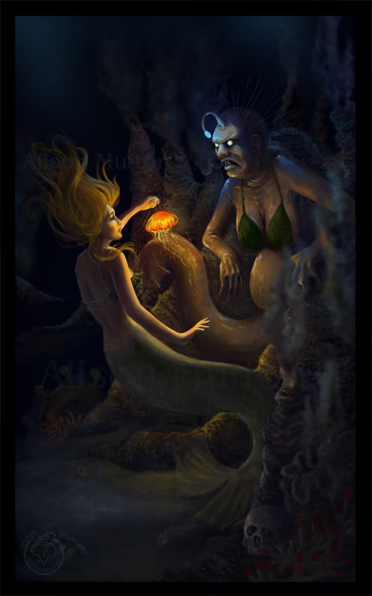
The Little Mermaid's Transformation

Here's a portfolio piece I did recently, as part of a small series of Little Mermaid illustrations I've been doing on and off. Currently two of them are finished. 


This is the scene where the Little Mermaid drinks the Sea Witch's potion, and grows legs. You can see the jar the potion was in floating away, after she drops it in the sea. 

I really wanted to have this image with the mermaid half in and half out of the sea - we can see the two worlds here, with the waterline as a barrier between them, as this part of the story is really about the Little Mermaid leaving one world and entering another. 

Here's a progress animation:


Adobe Photoshop CC2017 on a Wacom Cintiq Companion 2. 15-18 hours. 

Saturday, June 10, 2017

The Sea Witch

Here's a piece I redid for my children's illustration portfolio.


It was originally a realistic digital painting done way back in 2011. It was mainly to prove to myself that I could create something dark and scary, as with almost everything we were supposed to do at uni. I'm not really a dark and scary person, so I always struggled with that a bit, and wanted to see if I could create something scary off my own bat, a couple of years after I left uni. 

Here's the original. There's no place in my portfolio for anything like this now, so I took the concept and turned it into a children's illustration. I quite like redoing old pieces, if I think the concept is strong enough. It lets me see how much I've progressed, and also gives me a chance to fix all those little things that end up bothering me after I've finished a piece. 


Of course, turning it into a children's illustration meant that I no longer had to make it super-scary, which is much more my cup of tea. =P 

Here's a progress animation:


What do you think? Which version do you prefer?

Adobe Photoshop CC2016 on a Wacom Cintiq Companion 2. About 12-15 hours, I think.


Tuesday, June 6, 2017

Mariella

Here's a sort-of-new piece for my portfolio. It's a redo of a piece I did back in 2015 - essentially the same piece, but it's been entirely redrawn so it can stay in my portfolio without bringing down the tone.


It's intended as a book cover, so as I do a lot of work for self-publishers, I added text. This is a roll-over view option on my website. I know conventional wisdom is not to put text on book cover design, because illustrators are not graphic designers... but I do actually have a degree in graphic design. Anyway, self-publishers need to be able to see that I can add text without turning everything into a dog's breakfast.


If I was printing this, I can see spot varnish on the text, maybe even a foil.... but I'm not printing it, so you'll just have to use your imagination.
This has my name on it because it's my story. I've even written some of it!

Find out lots more about this illustration below the cut:

Wednesday, May 31, 2017

The Pirate Stall

'Are you looking to buy.... or looking for trouble?'

Here's a black and white piece I did for my Middle Grade portfolio a little while back. I'd been mucking about with pirates for my nightly sketching, and came up with this little character, who I rather liked. I had fun filling her stall with lots of different wares, and at the suggestion of a friend, I gave her a pet ferret to guard the money. People should think twice about stealing from her now!

As you can see, I'm still working on being sketchier with my final pieces and not getting too hung up on tiny details. What are your thoughts on this?


Here she is all coloured up. It was always intended as a black and white illustration, but I was curious to see how she'd look in colour, so when Colour Collective came up with 'Wenge' as their prompt last week I took that as a sign that I should slap on some colour and see what happened. Wenge is a rather dark, dull wood, so I kept everything looking a bit murky and just slightly sinister. I don't think this girl is necessarily selling wares she came by honestly....


Which do you prefer? Colour or black and white?

Here's a progress animation:


As you can see, this started out as just a character sketch. I don't do fully detailed scenes for my nightly sketching, if I did I'd never get to bed!


Here are some other pirate sketches I did about the same time. I started off with this one, referenced from a photo of someone in the Weekend Magazine. He wasn't a pirate, I just thought he had an interesting weathered face that would be a good fit for one:


I then did this quick little pirate girl:


And finally this character. I see him as the brother of my pirate girl above. They steal stuff to sell on - but to do that you need to know a real jewel from a bad one! 


I did muck about with adding him into the pirate stall scene, but as I hadn't originally planned to have him in there, he really didn't fit so well, so I didn't keep him. 

I used his sister in a recent Colour Collective, which I threw together far too quickly. See? I flipped the image part way through and forgot to fix her eyepatch. 

Adobe Photoshop CC2017 on a Wacom Cintiq Companion 2. Not entirely sure how long it took me, probably around five to eight hours, with another two on top for colouring. I used Kyle T Webster's Photoshop brushes. I'm pretty sure this was done entirely with the Perfect Pencil and Fat Fun Spongy brushes.

Wednesday, May 3, 2017

Alastair: 12-month Portrait

I keep thinking I have blogged this, and it appears I haven't, so I must rectify that! If you follow me on social media you will have seen snippets of this piece some months back; it's a piece I did for a friend's birthday in July. Her son, Alastair, was also born in July, just a week after her birthday, so it seemed like an excellent time to give her a 12-month portrait of his first 12 months of life. I was inspired by her remarking that he changed so much from day to day. I enlisted the help of her mother, who made sure I had a selection of nice photos for every month. Babies are so expressive, I had fun choosing lots of different moods! 


The painting is just under A3 in size, so each individual portrait is quite small:


I took a number of timelapse videos while I was working. All of them were shared after I had finished the painting and given it away, so that it was a complete surprise.


These last two timelapses are two parts of the same painting. The limit for a timelapse is 10 minutes, so I couldn't fit a whole painting into one. As it was, I always started with the base skin tones already down and dry - no one wants to watch a timelapse of paint drying!


Each individual portrait took in the region of 40 to 60 minutes to sketch and paint, so we're looking at somewhere in the region of 8 to 12 hours for the whole piece. I sketched each portrait out in pencil first, and then it's almost entirely watercolour, apart from a few coloured pencil touches, mainly in the background. I'm really a mixed-media girl. 
I decided to keep the focus on the face by making all of his clothes white - in reality he has a varied wardrobe, but that made everything rather messy when 12 pictures and placed side-by-side.

Winsor and Newton watercolours and series 7 brushes, with Prismacolor pencils, on Moleskine watercolour paper.

This makes a great gift for a mother in your life (or for yourself), so if you'd like to commission something similar, please contact me via my website - I'd love to discuss it with you!

Saturday, April 1, 2017

Bramble and Briar

I'm dividing my new website by age (so children's, middle grade, young adult) rather than the previous division of colour/black and white, digital/traditional, and realised that my Young Adult section was a bit thin. While staring into space trying to think of something to do for it, my eye fell on a portrait I did of a friend back in year 12, as one of the three paintings I did in TEE art. It's very dated now, my skills have improved so much, and I was never entirely happy with it as it was - and what better to put in a Young Adult illustration portfolio than a redo of a piece I myself did as a young adult? Plus, I'd come across the photos I took for it back in the day, while I was sorting out files on my computer. It was fate!

Here's the final piece:


I designed it as a book cover. I know everyone generally says that you shouldn't include text in your illustration portfolio as illustrators aren't qualified to work with type - but I have a degree in design, and I do a lot of work for self publishers, who need to see that I can apply type to a cover for them. So as a compromise, I have a version with text available upon roll-over on my website. Best of both worlds!


This isn't a real book. I came up with a title that fitted the image, and used a random name generator until I snagged one I liked for the author. I envisage that text being shiny gold foil....

It's quite a radical departure from the original painting I did back in 2004. I was referencing the Pre Raphaelites when I did it, and looking at the Victorian language of flowers. The plan was to do something very lush and a bit Bollywood inspired, with a huge bunch of white carnations, with a single red rose in the middle. But my art teacher didn't like that idea, and insisted I use coloured carnations, which really mucked up the message. I didn't paint the flowers very well anyway (not aided by the fact that I was working in oil paint, which gives me a bad migraine. Not the best situation for good painting!)

Here is the original:


Yeah. Oil paints really aren't my thing! 

So this was a chance to do it over, see how much I'd improved, and get more of the feel I'd originally been going for when I did the painting. However, I'm still scarred from painting all those carnations with a migraine, and I just couldn't bring myself to do a page full of carnations. So I went with all roses, influenced, no doubt, by the fact that I was listening to Robin Mckinley's Rose Daughter at the time.

Here's the reference photo. Isn't my friend gorgeous?


And here's a progress animation:


As you can see, one of the final stages was to add a colour adjustment and some lighting. That's the beauty of Photoshop. I also duplicated a lot of the roses, for which I am not sorry. =P 

All-up this took about 20 to 25 hours, and I did it in Adobe Photoshop CC2017 on a Wacom Cintiq Companion 2. No oil-paint-migraines for me this time!

Sunday, March 26, 2017

The Rock Pool

I did this little piece a few weeks back for Colour Collective's "Sweet Potato" prompt. I decided I'd have fun playing with a limited colour palette, since it was such a retro orange. It reminded me of the reading books my mother (a teacher) has from the 70s - black and white with one spot colour at different strengths. I am so glad we no longer have to separate colours for colour printing now!


Here's a look at my screen while I was in the sketching phase. As you can see, I had a reference that I'd picked up in a google search, but I was only using it very vaguely, really more as a way to get the balance of the figure right. When you're drawing a figure it helps to have some sort of reference to hand, just so you remember your proportions. (Yes, at some point after I took this screenshot I decided her legs were too lanky)


Adobe Photoshop CC 2016 on a Wacom Cintiq Companion 2. Not entirely sure how long it took me because I'm very late writing this post and I've forgotten, but it was a couple of hours. 

LinkWithin

Related Posts Plugin for WordPress, Blogger...