Showing posts with label girl. Show all posts

Friday, September 20, 2019

Nevermoor

I'd been reading Nevermoor, by Jessica Townsend, which is rather like Harry Potter, only without Harry - and as I always found Harry pretty irritating, this suits me down to the ground. It's the sort of fantasy kidlit book that makes me want to draw all of it, so I've been doing a few sketches:

"Suddenly that's what she was - a living tidal wave of rage and fear. She was not like him, she would never be like him."


"Morrigan stumbled backwards and instinctively threw up her arms, surrendering herself to the wave inside."

Sunday, February 3, 2019

Strange Noises in the Night

For Colour Collective's 'Midnight Blue' prompt, I decided to work in more of my middle-grade style. I've been working hard on picture books, and wanted a bit of a change so I revisited this little medieval girl from an earlier illustration, simplified her a bit, and went to town with a two-colour palette and ink-like outlines. It's nice to have a bit of a change now and then, especially when I'm working hard, and I enjoy middle-grade illustration just as much as picture book illustration! 

As you can see, I kept it simple, because I am working hard. Just enough background to suggest a medieval setting, and I was done in less than 2 hours. 


She's simple, but I quite like her. Here's a little peek at the quick sketch I did for her, snaffled from my Instagram Story. Remember to follow me on IG for lots of behind the scenes snaps!


Adobe Photoshop CC2019 on a Wacom Mobile Studio Pro

Sunday, January 13, 2019

SCBWI Draw This: Light

I had a bit of downtime, and thought I would take part in the monthly 'SCBWI Draw This' prompt. The theme was 'light', and I used it as an opportunity to practice perspective with no direct reference. To make my life harder, I chose to do 3-point perspective, which is the type I am the worst at - but hey, I'm not going to get better unless I practice, am I?


I thought it would be fun to have several references to 'light' in my illustration - moonlight, candle light, light as a feather, light as air...

Head below the cut to see the truly horrible sketch I did to try out the general idea, before I got my act together and made it pretty:


Sunday, October 7, 2018

Playing with Metallic Watercolours

When on holiday we stopped off in Singapore on the way home, partly to see Singapore (I had not been there since I was 6) and partly to readjust to our timezone after three weeks in the UK. And while I was there, I found a fabulous little art shop, Straits Art Co. Some friends who visit Singapore regularly told me about it, and I'm glad I hunted it down - there, I found some metallic watercolours. I'd been wanting some for a while, but they'd been proving elusive. I was able to mix and match my own palette of colours, so I grabbed silver, gold, bronze, green, blue and purple. It was a lovely little store, with lovely people.

But then it was finding the time to use them! A whole month and a half after getting back home, it was a lovely day, and it was Sunday, so I took my paints outside onto the deck and had a play for half an hour. I didn't do anything ambitious, I think the whole thing took 40 minutes, I just wanted to play with my new paints! I also tested a couple of colours of White Nights watercolour, which I had also picked up in Singapore. They were a bit more pigmented than I was expecting, but I'm sure I'll get used to that!


I took the opportunity to do a timelapse video while I was at it:


Winsor and Newton and White Nights watercolour, Copic multiliners and nameless metallic watercolours on a scrap of Moleskine watercolour paper.

Thursday, April 26, 2018

A spot of Divination

I tweaked this little illustration the other night, and ended up posting it as a secondary Colour Collective 'Laurel Green' because I didn't much like what I did specifically for CC. 
Twitter pixellated the bottom of the image for some reason, but she did much better than my original CC, so I think I was right not to be too keen on it. =P


This little witch can be traced all the way back to my highschool sketchbooks, although she looked rather different then. If I remember rightly she was blonde and wore a dirndl... but she has the same hat, and the same goose. 

I didn't change much, as I rather liked the original, but a few things had been bothering me (mainly the staff) so I wanted to make a couple of changes. The original blog post from last year is here

And here's another quick sketch of the same witch, from my 'Potential To Turn Into Something Bigger But Currently Bleh' sketch pile:


Adobe Photoshop CC2017 / 2018 on a Wacom Cintiq Companion 2 / Wacom Mobile Studio Pro

Sunday, March 11, 2018

Charlotte Brontë

For International Women's Day I coloured up this colouring page of Charlotte Brontë that is included in my Literary Romance Colouring Book. Charlotte Brontë is definitely one of the women of the past who paved the way for us today, even if she originally had to do so under a male pseudonym. 


She's sitting on the Brontë chair, a natural rock formation near her home.


If you'd like to colour this too, it's in my colouring book, along with 32 other pages - portraits of Austen and Gaskell, and illustrations from Sense and Sensibility, Pride and Prejudice, Persuasion, Jane Eyre, Wives and Daughters and North and South. Buy it here! (there is a trailer for the Austen section of the book on my website)

And as I did the colouring in in Procreate on the iPad Pro (using only the standard 6B pencil brush) here is a timelapse. For maximum size I've embedded my Instagram post (blogger uploaded it very tiny), so you'll need to click to the second image, the first is just the illustration itself.

A post shared by Alison Mutton (@alene.art) on

Sunday, February 25, 2018

Draughts

Over Christmas, while I had a small window of time where I didn't need to be working all the time (December-January is usually pretty crazy for me) I let myself do one watercolour, all for myself. I'd just finished several extremely tight deadlines and thought I deserved a bit of a play at Christmas time!

I do most of my work digitally these days, but I do love my watercolours, so I decided that I'd do a traditional painting - and to make it interesting, I decided to work with Mariella, my little ghost character, and see if I could pull that off with watercolour.


Keep reading below the cut for sketches, progress shots, videos and all that fun stuff!


Tuesday, June 6, 2017

Mariella

Here's a sort-of-new piece for my portfolio. It's a redo of a piece I did back in 2015 - essentially the same piece, but it's been entirely redrawn so it can stay in my portfolio without bringing down the tone.


It's intended as a book cover, so as I do a lot of work for self-publishers, I added text. This is a roll-over view option on my website. I know conventional wisdom is not to put text on book cover design, because illustrators are not graphic designers... but I do actually have a degree in graphic design. Anyway, self-publishers need to be able to see that I can add text without turning everything into a dog's breakfast.


If I was printing this, I can see spot varnish on the text, maybe even a foil.... but I'm not printing it, so you'll just have to use your imagination.
This has my name on it because it's my story. I've even written some of it!

Find out lots more about this illustration below the cut:

Sunday, March 26, 2017

The Rock Pool

I did this little piece a few weeks back for Colour Collective's "Sweet Potato" prompt. I decided I'd have fun playing with a limited colour palette, since it was such a retro orange. It reminded me of the reading books my mother (a teacher) has from the 70s - black and white with one spot colour at different strengths. I am so glad we no longer have to separate colours for colour printing now!


Here's a look at my screen while I was in the sketching phase. As you can see, I had a reference that I'd picked up in a google search, but I was only using it very vaguely, really more as a way to get the balance of the figure right. When you're drawing a figure it helps to have some sort of reference to hand, just so you remember your proportions. (Yes, at some point after I took this screenshot I decided her legs were too lanky)


Adobe Photoshop CC 2016 on a Wacom Cintiq Companion 2. Not entirely sure how long it took me because I'm very late writing this post and I've forgotten, but it was a couple of hours. 

Tuesday, November 29, 2016

Night is falling

This is last week's Colour Collective. The colour was 'Sea Blue', but I used it as a sky colour instead. I'd had a really stressful week, preparing for a small expo and panicking because there was a delay in printing and shipping the colouring books I was going to be selling (more on those soon, they're currently going through the process of being sold on Amazon, and I'll do a whole post on them when they're up) - so i was stressed and tired and just wanted to draw something easy. So I resorted to defaults - pretty girl in pretty dress. I tried to make it slightly more interesting, however, by turning her into the sky:


I recycled the background from an old illustration, so the two don't gel together as well as they should - but it was better than leaving her on a plain white background, and I was in a hurry! (Colour Collective time is 3.30am my time, so I usually Buffer my posts anyway, but this week I had to be in bed unusually early before the Expo on Saturday, so time was of the essence! =P)

This probably took about 3 hours, using Adobe Photoshop CC 2015 on a Wacom Cintiq Companion 2.

Sunday, November 6, 2016

Algerian Girl

Every now and then I do portraiture demonstrations. People prefer to see portraiture being demonstrated, I find: they can see exactly what I am trying to do, and judge how well I am doing. If I'm illustrating only I know what it's supposed to look like! I've tried demonstrating illustration, but it never goes down so well.

This is one of my demonstration portraits. In previous years I've always done actors and actresses, but I saw a 19th century photograph of an Algerian girl and thought it was beautiful, so I used that. 


I started it for demonstration purposes in October 2015, and only finished it up in October of this year, so I could enter it in a show (I won first in portraiture!!). 

Here are some progress shots, all taken while I was working and posted on Instagram. Some of them are a bit fuzzy, I was quickly snapping shots with my phone between chatting to people, and the lighting was pretty poor:

1.5 hours in:


2.5 hours in:


3.5 hours in:


4.5 hours in:


That was the end of my demonstration time - after that I switched to needle felting.

Here she's almost finished:


Graphite on sketchbook paper 20cm diameter, 8-10 hours in total. If you'd like a rundown of all the materials I use in pencil portraiture, I have a list here.

Here's the original photograph:

Source: Matthew's Island of Misfit Toys

Thursday, October 20, 2016

The Butterfly

By the time Colour Collective rolled round with the gorgeous 'Kings Blue Light' for the 30th September, I had very little time to create anything. It was a week full of appointments and outings and tradesmen and guests - not to mention I had work to do at the same time! But I didn't want to sit Colour Collective out - I've never missed one! - so I threw this together:


I just worked up a bedtime sketch I had done earlier in the week. We'd been watching Granada Austen adaptations from the early 1970s, and they have such spectacular hairstyles that I was inspired to sketch ridiculous hair myself. Such subjects are excellent when you just want to wind down before heading to bed: 


For Colour Collective I added a bit more body to one of the sketches, sketched in a bit of a balcony, and slapped on some quick colour. The whole thing took maybe two hours in Adobe Photoshop CC2015 on my Wacom Cintiq Companion 2.

Saturday, September 17, 2016

Butterflies and Secret Portals

For Colour Collective's 'Sage Grey' prompt I was inspired by Scandinavian tales. Sage is an herb, of course, but it can also refer to someone who has gained wisdom, so I decided to use that meaning to direct my illustration, and created a wise troll character to blend in with the grey rocks. I do like to try different things with my Colour Collective pieces, it's such a good opportunity for experimentation!


I was also heavily inspired by Swedish golden age illustrator John Bauer, who illustrated for Bland Tomtar Och Troll (Among Gnomes and Trolls), a Swedish folklore anthology, from 1907 to 1915. He was succeeded by Gustaf Tenggren. I looked at a lot of Bauer and Tenggren's work when I did my thesis on Golden Age Illustrators, but didn't have any opportunity to be influenced by their Scandinavian aesthetic in my own work at that time, as it didn't match my thesis project, which was much more influenced by the Russian and Turkish elements of Golden Age illustration.

Image from Wikipedia
Here's a progress gif. I worked on it in brief snatches over the week, and in total spent about 8 hours on it, almost all as wind-downs after finishing my day's work. If I'd had more time I would have liked to have added more details, more beads and leather and the like, like the trolls in Bauer's work above.... but as it is, I'm pretty swamped with work so I kept it minimal. I had a lot of fun doing those curvaceous rocks!


And here's a detail of the faces:


Adobe Photoshop CC2015 on a Wacom Cintiq Companion 2, using Kyle Webster's brushes.

Wednesday, August 31, 2016

Portrait Card

Here's a commissioned one-off watercolour portrait card that I completed last month. I was given a photo of the girl in question jumping in front of a fountain somewhere in Europe to use as a base. The client wanted enough of the background remaining for the original location to recognisable to the recipient, so I left in the fountain and added a few trees. I also enlarged the girl quite a lot from the original photo, to make her the focus of the card.


It was a difficult format to work from, to fit in a jumping girl and the fountain in the space of a standard ratio greeting card. I would have preferred a longer format so I could have more space below her, but I didn't have an envelope that size. If this was an illustration I would have done things a bit differently, but for a portrait from a specific photo, I kept everything as close to the original as possible. I altered all the colours from the winter photo - from blacks and khakis to more pastel colours - to work with the birthday theme and added some spatters and metallic paint to give the whole thing more fun and energy, along with flicking out the hair and jacket and other artistic-license tweaks. =)   

Four hours using Copic Multiliners, Winsor and Newton watercolours and metallic gold Ecoline on Moleskine watercolour paper.  

Sunday, August 28, 2016

The Rains are Coming

Belatedly, here is my Colour Collective from two weeks ago. I've had a bit of a hectic week, but the main occurance preventing my posting earlier was spending a lot of time with tech support after our service provider broke my business email. All that is sorted now, and I'm back in a more normal routine. =) 

The set colour was 'thistle', a bright pale purple. Obvious connotations were fairies and the like, but I tried to steer away from the obvious. I was watching Brian Cox's Forces of Nature, and the episode featured some Maasai. The women were so beautiful, and one of them was wearing a purple baby sling, so I went from there. I also used the set colour in the sky, to create a suitably dramatic impending storm. I liked the contrast of the purple sky against the yellow grasses. 


I'm trying to get more texture into my illustrations, so for this I played around with a lot of Kyle Webster's bristly brushes that I haven't used all that much. Colour Collective is a good space for experimentation.

About 5 hours in Photoshop CC 2015 on a Wacom Cintiq Companion 2.

Tuesday, March 15, 2016

Beatrix Potter

For Colour Collective's 'Pale Geranium Lake' prompt, I decided to draw a young Beatrix Potter in a field of poppies. It being the 150th anniversary of her birth this year, as well as Women's History Month (and International Women's Day just a couple of days before) it seemed like an apt topic. 


Obviously you can't draw Beatrix Potter without a bunch of bunnies (well, probably you can, but why fight it?) and I added a squirrel into the mix because squirrels are cute. Here's a detail:


I dropped a page of Beatrix Potter's own sketchbook (age 9) into the sketchbook. (You'll have to bear with me, I can not find where I found the double-page spread I used...) The figures are rabbits, all dressed up and doing things, although the original image I used was so small that I'm not entirely clear on what.... Some of them may be iceskating. 

There are quite a lot of photos of the young Beatrix floating around the internet, so I used a lot of them as references. If I go back in and fiddle with this piece, as I probably will (I'm always a bit rushed with my Colour Collective pieces), I think I should make her hair a bit darker. I got a carried away with the sunny summer atmosphere, and somewhere along the line she went a bit honey-coloured. Oops.

Image from Birnam Arts
Adobe Photoshop CC2015 with a Wacom Cintiq Companion 2. About 10 hours.

Saturday, February 27, 2016

Pangolins

When I saw Colour Collective's 'Moss' theme, it made me thing of lush, humid rainforests. The only rainforests I personally have experienced have been in south-east Asia, and my original plan was to have two Malaysian children with some jungle fowl for some bright red accents... But then World Pangolin Day came around and I was reminded of how cute pangolins are. So I changed my plan to include pangolins. 


The butterflies are Rajah Brooke's Birdwings - the national butterfly of Malaysia, and completely stunning. They're quite big, too. Here's one sitting on my shoulder, for scale, and one sitting on a flower, because I'm pleased with that photo:


And here's a video of a pangolin climbing a tree (note that this is (I think) a black-bellied pangolin from Africa. I was drawing a sunda pangolin from South-East Asia. Or, to put it another way, no, I didn't completely ignore the colouring when painting them. =P)


I added a batik pattern to the girl's dress to continue the Malaysian theme, and I am reminded that I have the stuff to do batik, and really must get round to actually doing some. Anyone got some extra hours in the day that they don't need?

Adobe Photoshop CC on a Wacom Cintiq Companion 2. Still playing with Kyle T Webster's Photoshop brushes, too. 

Saturday, January 9, 2016

Little Red Riding Hood


Here's an illustration I did last November, but have only just got around to posting, because things got busy. I did it for the SCBWI Tomie De Paola Award (I didn't place, but I wasn't expecting to. But you've got to be in it to win it, and anyway, it gave me something for my portfolio and an excuse to paint!). The brief was to draw Little Red Riding Hood 'as if he was meeting her for the first time', to have a unique visualisation of the character without being too 'designed' and without copying the images that are already out there. We were also given text (up to the point where she first meets the wolf) from Phillip Pullman's Fairy Tales From the Brother's Grimm – which rather precluded setting the story somewhere exotic, or anything like that, which was a pity, as I enjoy doing that. 

So I went back to the roots of the story, which has been traced back to 10th Century French peasants, and set it somewhere in the 10th to 12th centuries. The line I chose to illustrate was 

"Her grandmother, who loved her more than anyone, made her a little cap of red velvet that suited her so well that she wanted to wear it all the time." 

I thought it would be nice to show the relationship between Little Red Riding Hood and her grandmother, as often she doesn't really feature in the story. I wanted to give a glimpse of their lives through the details in the illustration, and decided that the grandmother created fine fabrics for the nobility, thus solving the problem of what a peasant is doing with red velvet. I researched medieval peasant cottages, looms and spindles so that I could cram as much in as I could. I really wanted to put chickens in as well, but thought it might be too busy if I did. 

Here's a progress animation showing the stages I went through:


I started with a digital sketch, which obviously went through a few hideous and messy stages before I ended up with the clean linework shown here. I then did a digital colour study. I like to do my colour studies before I start the traditional linework so that I can check that everything looks okay. I then inked the linework over a lightbox, using a brush and sepia ink. After that it was time to paint, and finally I scanned it in and did a bit of digital adjustment to enhance the lighting and generally clean it up. 

Winsor and Newton watercolours and FW Artists' Acrylic in Burnt Umber on Moleskine watercolour paper with Winsor and Newton Series 7 brushes. About 25 hours. 

Thursday, October 29, 2015

Illustration: The Quest


Over the last few weeks I have taken part in Giuseppe Castellano's Illustration Department 3-Week Illustration Workshop. There aren't as many opportunities for workshops and the like here in Perth, and I was feeling a bit like I was working in a bubble - it was time to get some new feedback on my work and push myself to explore in different directions. Giuseppe's online course was perfect, slotting very nicely into a slow period of work and finishing just as work picked up again. 

In the first video conference Giuseppe went through my portfolio website, identifying pieces that worked the best and areas that needed work. He then gave me an assignment. He had flagged my heavy use of black outline in a lot of my work, and wanted to see me using a looser, non-black line, and also to tone down my colours a bit. 

My assignment was as follows:

Create a traditional piece, 8x10", subject matter open but using line that is not black and not 'outline' and a dead colour palette. 

He also suggested I look at Tony Diterlizzi and Arthur Rackham.  

The first few days after I got the assignment I was too busy to start. I had some artworks to complete, and it was also the weekend of the Kelmscott Annual Show and I spent the entirety of Saturday demonstrating portraiture and needle felting in the exhibition hall. However, I used that time to plan out my illustration in my head, sort of mentally thumbnailing. 

Lots of people, I hear, choose to redo an exiting portfolio piece with their assignments, but instead I decided to do something with a sketch that was sitting in my sketchbook, and that I thought had potential. I knew what I wanted to do with it would be difficult, so I wanted a reason to actually get started, do my best with it, and finish it.


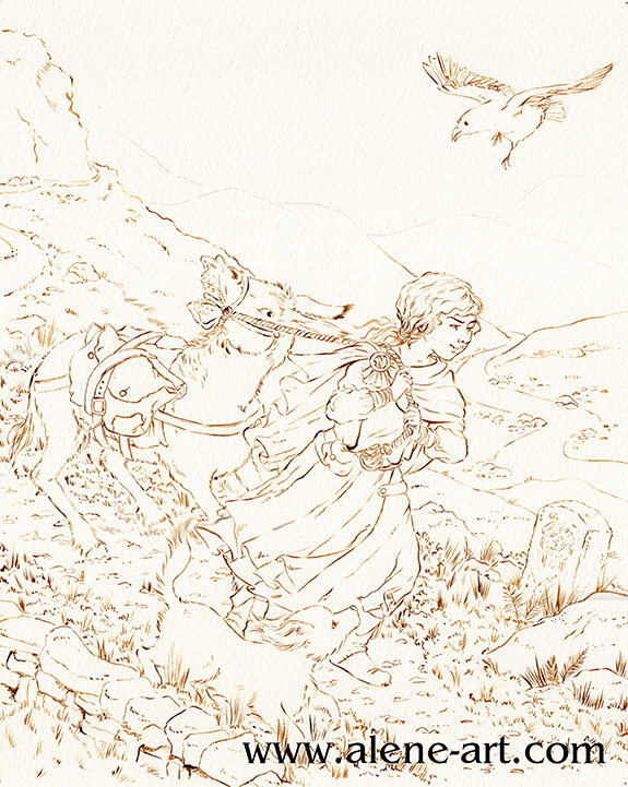
I'd picked up The Islands of Chaldea, Diana Wynne Jones' last book, in the bookshop, and sketched this while I was reading it. It was a bedtime sketch, so not particularly imaginative in terms of layout or anything, just a rough sketch based around a scene in the book.

For my assignment I didn't actually want to illustrate The Islands of Chaldea, but I thought the basic idea of a donkey that didn't want to go was a good starting point, especially as it had been suggested that I look at Tony Diterlizzi's work. To actually be an illustration for The Islands of Chaldea the girl would have to have brown hair, the raven would be a parrot, the donkey would be pulling a cart, there would be several other people and the dog would be a magical cat. 

Here is the rough thumbnail I did before I started sketching, just to check that the basic concept I had planned in my head over the previous few days worked:


I then did a rough digital sketch based around that thumbnail:


I kept each part in a different colour so that I could see what was what. Sketching can get messy and it's so easy to get lost in a mass of linework. 

I then did a refined draft linework, still digital:


As you can see, I flipped the image. Images read best left to right, but being right-handed I draw best in the other direction. Why fight it when I'm working digitally and can easily flip once the difficult bits are drawn? I also altered the donkey's expression quite a lot, to make sure it was very clearly not happy.

I had planned the image with a diagonal cut across the composition, as Arthur Rackham had been mentioned in our first conversation. I did my honours thesis on Golden Age Illustrators, with a fairly heavy focus on Rackham and Dulac, so as a bit of a nod to him I utilised I popular Golden Age compositional trick, where the composition is cut diagonally, with most of the action happening in the bottom half. This was originally inspired by Japanese woodcut compositions, after the trade borders opened up in the 1870s and it's a composition I rather like.

All these images are from my Golden Age Illustration Pinterest board. Head over there if you would like to see them bigger.

Finally I did a colour study. Not only was I going to be using a colour scheme that wasn't my usual one, but a lot of the parameters for my assignment had to do with colour and linework - none of which come across on a digital draft!


I sent this, and the draft linework, off. Giuseppe was generally happy with it, his only concern being that the raven was the only dark part of the image and threw the balance off. He suggested I darken the tones in the foreground to fix this, and gave me the go-ahead to start on the final.

Before I could start on the final, however, I had to get some ink. Easier said than done in Western Australia! I went to my local art shop, wanting waterproof ink in any dark colour that wasn't black - sepia, dark grey, paynes grey, I wasn't choosy, but the shop wasn't very helpful. In the end I managed to snag some FW Acrylic Artists Ink in Burnt Umber. It's only water resistant, not waterproof, so if I was really working the watercolour in some areas it got a bit lost and I had to go back in and touch up, but overall I think it worked well. I also bought a cheap 2/0 sable brush so that I didn't kill my expensive brushes with the ink.


Having completed the inking it was time to paint. These are the materials I used:


The red tones were used the least. I researched dead palettes before I started, and a lot of the info stressed the need for one spot of bright, saturated colour. In my case it was the hair of my girl character. I used Cadmium Scarlet and Winsor Orange for her hair, and some Rose Dorè on her skin. Indian Red added the lowlights in her hair, and was also used on some of the browns elsewhere in the image, so that the red tones were spread just a little. 
It's almost entirely watercolour, but I did get out my coloured pencils at the very end, just to darken some of the shadows and add some extra leafiness to the vegetation in the foreground, and also darkened a couple of lines with a sepia PITT Artist's Pen (not shown). 


I sent the above image off to Giuseppe and we discussed it during my final conference. 

He was happy with it, and especially pleased with my use of leading lines (in the pathway and the river) and my treatment of the fabric and the figures, but flagged a few places where it could be improved:

The sky was a bit too busy
The figures didn't stand out from the background enough
The dog got lost

I agreed with everything he pointed out, so after our meeting I took the painting into Photoshop and made some adjustments:


What do you think? An improvement? 

The sketch, being a complicated one where I was trying new things (especially with the donkey) took about 9 hours, I think, and it took another 14-18 to paint it, although there were some pauses in there while I waited for paint to dry.

LinkWithin

Related Posts Plugin for WordPress, Blogger...