Showing posts with label brush. Show all posts

Monday, February 20, 2017

More Cards!

Here are some more hand painted cards from last year. First up, a baby card. You may remember the baby cards I've already blogged, one of which was for a cousin's second baby girl. That cousin's sister had her second baby girl shortly afterwards, so I did another card in the same style:


Here's a video of me painting that card:


Around the same time I also needed to make a nice sympathy card for a family friend who had had a short battle with cancer:


And here's a video of me working on that. Towards the end you can see me adding Perfect Pearls for a bit of a shimmer - they're a fine pearlescent powder, and I use an embossing pen (actually, a proper Perfect Medium pen - often I don't have the 'proper' tools =P) to get them to stick.


Both of these cards were done with watercolour and a water pen, over ink (both Copic Multiliners and a Pentel Brush Pen), and the drawing behind the watercolour images is tinted with prismacolour pencils.

Saturday, October 8, 2016

Miss Bear

Here's another recently-completed pet-portrait - this time of a cat! I don't do many cats, my pet portraits tend to be a long line of dogs.

Miss Bear is a beautiful siamese. I was given a few photos to choose from, and chose a pose where she was sitting up straight and proud, as befits a siamese cat:


The background went through a couple of iterations. Apparently she likes to sit by the fire, and so the commissioner (who was commissioning a present for the friend than owns (or is that 'is owned by'?) Miss Bear) originally wanted her sitting on a hearth in front of a roaring fire.
Fire is pretty revolting to paint, so I wasn't exactly looking forward to that, but I was fully prepared to give her a cosy fire... and then I learned that the recipient is red-green colourblind. I did a bit of checking to find out exactly how red-green colourblind people see the world, and found that red appears, basically, yellow. This didn't bode well for painting a fire, where I would be exclusively using red, orange and yellow. I just didn't feel confident that I could paint a convincing fire that would work for a colourblind person, so I contacted the commissioner and suggested a different option - a black and white floral background inspired by the designs of William Morris - lots of nice contrast that would work well for a colourblind person, with a bit of gilding added in to catch the light and liven everything up. Siamese cats are so graphic themselves that I thought the background would work well. The commissioner liked that idea, so I went with that.

Here I'll collate some of the progress snaps I shared on Instagram, and my Instagram Story, as I worked:

I did the draft in Photoshop, on my Cintiq Companion 2 - it just made it much easier to work out the pattern, and repeat areas, without constantly worrying that I was filling in the wrong thing or drawing lines in the wrong place:


I printed out my digital draft and used my lightbox to trace it onto Moleskine Watercolour paper using Copic Multiliners:


Eventually I had everything inked:


I filled in the background with black Ecoline, while Miss Bear herself was painted in Winsor and Newton watercolours with details added in Prismacolour pencil:


The final stage was to add some gilding. I used Cosmic Shimmer Gilding Flakes in Autumn Leaves. This photo shows just how shiny the gilding flakes are:


Here's a video I took to show how I applied the gilding:


Finally, I created 15 greeting cards using the painting. They were too small to use this gilding technique, so I went over all the gilded areas with different coloured metallic gel pens - not as shiny, but better than nothing. 


Copic Multiliners, Winsor and Newton watercolours, Prismacolour pencils and Cosmic Shimmer gilding flakes on Moleskine watercolour paper. Six and a half hours in total (not counting the cards).

Thursday, October 29, 2015

Illustration: The Quest


Over the last few weeks I have taken part in Giuseppe Castellano's Illustration Department 3-Week Illustration Workshop. There aren't as many opportunities for workshops and the like here in Perth, and I was feeling a bit like I was working in a bubble - it was time to get some new feedback on my work and push myself to explore in different directions. Giuseppe's online course was perfect, slotting very nicely into a slow period of work and finishing just as work picked up again. 

In the first video conference Giuseppe went through my portfolio website, identifying pieces that worked the best and areas that needed work. He then gave me an assignment. He had flagged my heavy use of black outline in a lot of my work, and wanted to see me using a looser, non-black line, and also to tone down my colours a bit. 

My assignment was as follows:

Create a traditional piece, 8x10", subject matter open but using line that is not black and not 'outline' and a dead colour palette. 

He also suggested I look at Tony Diterlizzi and Arthur Rackham.  

The first few days after I got the assignment I was too busy to start. I had some artworks to complete, and it was also the weekend of the Kelmscott Annual Show and I spent the entirety of Saturday demonstrating portraiture and needle felting in the exhibition hall. However, I used that time to plan out my illustration in my head, sort of mentally thumbnailing. 

Lots of people, I hear, choose to redo an exiting portfolio piece with their assignments, but instead I decided to do something with a sketch that was sitting in my sketchbook, and that I thought had potential. I knew what I wanted to do with it would be difficult, so I wanted a reason to actually get started, do my best with it, and finish it.


I'd picked up The Islands of Chaldea, Diana Wynne Jones' last book, in the bookshop, and sketched this while I was reading it. It was a bedtime sketch, so not particularly imaginative in terms of layout or anything, just a rough sketch based around a scene in the book.

For my assignment I didn't actually want to illustrate The Islands of Chaldea, but I thought the basic idea of a donkey that didn't want to go was a good starting point, especially as it had been suggested that I look at Tony Diterlizzi's work. To actually be an illustration for The Islands of Chaldea the girl would have to have brown hair, the raven would be a parrot, the donkey would be pulling a cart, there would be several other people and the dog would be a magical cat. 

Here is the rough thumbnail I did before I started sketching, just to check that the basic concept I had planned in my head over the previous few days worked:


I then did a rough digital sketch based around that thumbnail:


I kept each part in a different colour so that I could see what was what. Sketching can get messy and it's so easy to get lost in a mass of linework. 

I then did a refined draft linework, still digital:


As you can see, I flipped the image. Images read best left to right, but being right-handed I draw best in the other direction. Why fight it when I'm working digitally and can easily flip once the difficult bits are drawn? I also altered the donkey's expression quite a lot, to make sure it was very clearly not happy.

I had planned the image with a diagonal cut across the composition, as Arthur Rackham had been mentioned in our first conversation. I did my honours thesis on Golden Age Illustrators, with a fairly heavy focus on Rackham and Dulac, so as a bit of a nod to him I utilised I popular Golden Age compositional trick, where the composition is cut diagonally, with most of the action happening in the bottom half. This was originally inspired by Japanese woodcut compositions, after the trade borders opened up in the 1870s and it's a composition I rather like.

All these images are from my Golden Age Illustration Pinterest board. Head over there if you would like to see them bigger.

Finally I did a colour study. Not only was I going to be using a colour scheme that wasn't my usual one, but a lot of the parameters for my assignment had to do with colour and linework - none of which come across on a digital draft!


I sent this, and the draft linework, off. Giuseppe was generally happy with it, his only concern being that the raven was the only dark part of the image and threw the balance off. He suggested I darken the tones in the foreground to fix this, and gave me the go-ahead to start on the final.

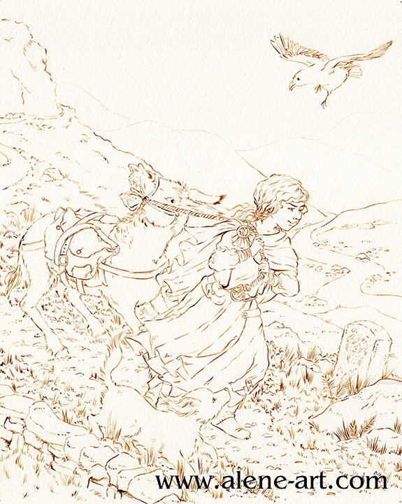
Before I could start on the final, however, I had to get some ink. Easier said than done in Western Australia! I went to my local art shop, wanting waterproof ink in any dark colour that wasn't black - sepia, dark grey, paynes grey, I wasn't choosy, but the shop wasn't very helpful. In the end I managed to snag some FW Acrylic Artists Ink in Burnt Umber. It's only water resistant, not waterproof, so if I was really working the watercolour in some areas it got a bit lost and I had to go back in and touch up, but overall I think it worked well. I also bought a cheap 2/0 sable brush so that I didn't kill my expensive brushes with the ink.


Having completed the inking it was time to paint. These are the materials I used:


The red tones were used the least. I researched dead palettes before I started, and a lot of the info stressed the need for one spot of bright, saturated colour. In my case it was the hair of my girl character. I used Cadmium Scarlet and Winsor Orange for her hair, and some Rose Dorè on her skin. Indian Red added the lowlights in her hair, and was also used on some of the browns elsewhere in the image, so that the red tones were spread just a little. 
It's almost entirely watercolour, but I did get out my coloured pencils at the very end, just to darken some of the shadows and add some extra leafiness to the vegetation in the foreground, and also darkened a couple of lines with a sepia PITT Artist's Pen (not shown). 


I sent the above image off to Giuseppe and we discussed it during my final conference. 

He was happy with it, and especially pleased with my use of leading lines (in the pathway and the river) and my treatment of the fabric and the figures, but flagged a few places where it could be improved:

The sky was a bit too busy
The figures didn't stand out from the background enough
The dog got lost

I agreed with everything he pointed out, so after our meeting I took the painting into Photoshop and made some adjustments:


What do you think? An improvement? 

The sketch, being a complicated one where I was trying new things (especially with the donkey) took about 9 hours, I think, and it took another 14-18 to paint it, although there were some pauses in there while I waited for paint to dry.

Friday, November 28, 2014

Process: Toughen Up, Princess

Here's a look at the process for one spread in Toughen Up, Princess:

After the basic idea for the spread was decided on I did some very rough digital sketches and made up a dummy so we could see how the book worked as a whole. This spread is for the first two pages of 'The Annual Evil Queen's Garden Tea'
I like doing my initial sketch work directly onto the computer, as I can move things around much more easily. Once I'm ready to do things properly, I move to good old pencil and paper, because I draw much better that way.


After meeting with the author, it was decided that the evil queens looked too beautiful, and that they should be drinking tea from teacups. So I went off to do a revised dummy sketch. I did these revised queens in my sketchbook, making the most of my time waiting at the hairdressers and doing other errands. 


I then sent a revised mockup to the author. You'll notice that between the first draft and this one, the queen on the far right changed. I'd been having trouble coming up with enough recognisable evil queens, and had stuck in The Red Queen from Alice Through the Looking Glass. I wasn't entirely happy with this, she didn't seem to me iconic enough to be easily recognisable, especially as the illustration was to be in black and white. I had also been having trouble making the illustration suitably Australian.... and then, while walking the dog, I had an epiphany: Odile from Swan Lake is a black swan, and black swans are Australian! So I switched queens:


After getting approval for the revised mockup, I moved on to my tight pencils:


I sent the pencils off for approval, and once I had it I could move on to inking. I find it's good to have as many stages as possible where the client can make changes and it's still easy to do so – once you've moved on to inking, changes generally require redoing the whole thing – so I like to make sure the final draft has the complete okay.


I used a Pentel Brush Pen to ink all of the spreads. The solid backs you see here are Ecoline ink.

After that, it was time to paint. I used a mixture of Ecoline (in Black and Cold Grey) and Winsor & Newton Watercolour (in Neutral Tint) for this book:


After that I just had to typeset the page, and the spread was done!


Sunday, June 5, 2011

Sketches: Dr Who

I recently realised that I hadn't actually done any sketching from Doctor Who in anything approaching recent memory. The last Doctor Who pic I did was a portrait of David Tennant (which I was never even remotely happy with) in 2007 to accompany a portrait of Christopher Eccleston that I'd done previously. I love to sketch people and I grew up watching Doctor Who, so the lack of sketching had to be remedied. 
I have plans to do a full portrait of Matt Smith as the doctor later this year, when I'm doing a live portraiture demonstration, but in the meantime, he's awfully fun to sketch. So here's my tv sketching from this evening:


I want to get better at caricaturing people into my style (and pushing that style a bit, too), so a couple of these were trying to head in that direction, and the others were just semi-realistic sketching (especially the top centre of Matt Smith and Karen Gillan). All bar that little one in the lower right corner were referenced from screenshots I took of episodes in Season 5. 
These were done with a 0.5 mechanical pencil with a #B lead in a Jasart 'My Memoirs' sketchbook. 

Also, here are some ink and Ecoline sketches I did of the main Season 6 cast, referenced from publicity photos, as experiments in ink outlines and single-colour washes. 


These did not want to scan, and they weren't too happy about being photographed, either, so quality is low and not indicative of what they look like in person. Which is a shame; they're nothing stellar, but they do look a bit better offscreen. 
Artline 0.1 and Ecoline ink (in red, brown and yellow) in a Moleskine Watercolour Sketchbook.

Tuesday, April 6, 2010

Inking

Today, some very early brush inking practice, from December '09.
Having started out inking with ordinary felt-tips in highschool, moving onto technical pens, and then mastering the dip pen, I felt it was time to start using a brush to ink, and embellishing the results with greyscale watercolour.

My first two attempts were from earlier pencil sketches; a fisherman and a 30s glamour girl, inspired, I think, because I was watching The Alleyn Mysteries at the time.


And then I moved on to ink another earlier sketch, of my friend Makenzi's lovely character Ella:

Ella is copyright Makenzi Crouch, all rights reserved. You can also see her aged about 7 at my deviantart account here : Ella in the Cathedral

LinkWithin

Related Posts Plugin for WordPress, Blogger...