Showing posts with label cover. Show all posts

Tuesday, October 1, 2019

The Lost Stone of SkyCity

Earlier this year I had the pleasure of illustrating the cover for HM Waugh's debut middle grade adventure, The Lost Stone of SkyCity with Fremantle Press. To celebrate the release of the book today, here's a little look at the process I went through.


See more after the break!


Tuesday, June 6, 2017

Mariella

Here's a sort-of-new piece for my portfolio. It's a redo of a piece I did back in 2015 - essentially the same piece, but it's been entirely redrawn so it can stay in my portfolio without bringing down the tone.


It's intended as a book cover, so as I do a lot of work for self-publishers, I added text. This is a roll-over view option on my website. I know conventional wisdom is not to put text on book cover design, because illustrators are not graphic designers... but I do actually have a degree in graphic design. Anyway, self-publishers need to be able to see that I can add text without turning everything into a dog's breakfast.


If I was printing this, I can see spot varnish on the text, maybe even a foil.... but I'm not printing it, so you'll just have to use your imagination.
This has my name on it because it's my story. I've even written some of it!

Find out lots more about this illustration below the cut:

Saturday, April 1, 2017

Bramble and Briar

I'm dividing my new website by age (so children's, middle grade, young adult) rather than the previous division of colour/black and white, digital/traditional, and realised that my Young Adult section was a bit thin. While staring into space trying to think of something to do for it, my eye fell on a portrait I did of a friend back in year 12, as one of the three paintings I did in TEE art. It's very dated now, my skills have improved so much, and I was never entirely happy with it as it was - and what better to put in a Young Adult illustration portfolio than a redo of a piece I myself did as a young adult? Plus, I'd come across the photos I took for it back in the day, while I was sorting out files on my computer. It was fate!

Here's the final piece:


I designed it as a book cover. I know everyone generally says that you shouldn't include text in your illustration portfolio as illustrators aren't qualified to work with type - but I have a degree in design, and I do a lot of work for self publishers, who need to see that I can apply type to a cover for them. So as a compromise, I have a version with text available upon roll-over on my website. Best of both worlds!


This isn't a real book. I came up with a title that fitted the image, and used a random name generator until I snagged one I liked for the author. I envisage that text being shiny gold foil....

It's quite a radical departure from the original painting I did back in 2004. I was referencing the Pre Raphaelites when I did it, and looking at the Victorian language of flowers. The plan was to do something very lush and a bit Bollywood inspired, with a huge bunch of white carnations, with a single red rose in the middle. But my art teacher didn't like that idea, and insisted I use coloured carnations, which really mucked up the message. I didn't paint the flowers very well anyway (not aided by the fact that I was working in oil paint, which gives me a bad migraine. Not the best situation for good painting!)

Here is the original:


Yeah. Oil paints really aren't my thing! 

So this was a chance to do it over, see how much I'd improved, and get more of the feel I'd originally been going for when I did the painting. However, I'm still scarred from painting all those carnations with a migraine, and I just couldn't bring myself to do a page full of carnations. So I went with all roses, influenced, no doubt, by the fact that I was listening to Robin Mckinley's Rose Daughter at the time.

Here's the reference photo. Isn't my friend gorgeous?


And here's a progress animation:


As you can see, one of the final stages was to add a colour adjustment and some lighting. That's the beauty of Photoshop. I also duplicated a lot of the roses, for which I am not sorry. =P 

All-up this took about 20 to 25 hours, and I did it in Adobe Photoshop CC2017 on a Wacom Cintiq Companion 2. No oil-paint-migraines for me this time!

Friday, March 11, 2016

The Little Book of Silly Rhymes & Odd Verses

In January, Ian Andrew contacted me, looking for illustrations for his poetry book, The Little Book of Silly Rhymes & Odd Verses. He didn't want polished illustrations, he wanted sketches that weren't too refined (in his words, 'crude') - a departure for me, but I always do my best to deliver on what a client wants! I sent him links to a few of my sketchbook pieces to check that that was what he was after, and he was happy with the level of detail.


As well as the interior illustrations, I also did the cover and the typesetting. I also did work on the Kindle version, but due to technical difficulties Ian did most of it himself. (Amazon's Kindle plugin for inDesign doesn't work with Creative Cloud, stopping at CS6, the Kindle Previewer doesn't work on my iMac. I did a lot of fiddling on an ancient macbook that still has CS4 on and can just about handle it, but the Kindle plugin also doesn't allow images behind text and insisted on showing them as incredibly tiny thumbnails. In the end I sent the stuff to Ian and he put it together in Amazon's Kid's Book Creator (which I could use, but the preview didn't work. I'm inclined to think Amazon could provide better software!)

I did 18 sketch illustrations for the book overall, plus the cover. Ian was great to work with. I initially worked out each image digitally and sent him a pdf of the book with the drafts in place. He didn't want any substantial changes other than the addition of one more drawing. I then used my lightbox to sketch directly over my drafts on fresh layout paper, keeping things as loose as I could. This was a little tricky for me, as usually I refine everything (probably a little too much) so I worked hard at not obsessing over details. 

Here is a small sample:


This Chihuahua is based on a real one. I was sent photos to use as reference, and it was the grumpiest chihuahua I have ever seen. I adjusted the elf costume a bit, as the original would have looked a bit weird in a rough pencil sketch. 


One of the poems was about the Irish town of Larne. The artist is Larne watercolourist Sam McLarnon who is mentioned in the poem and was loosely referenced from an image by Bernie McAllister - a relative of Ian, which was handy! Ian asked that I use that image for the cover as well. 

When I'd painted the cover and filled the gaps left in the original sketch for the text, I decided that the front was really too bare. It needed something more. I toyed with the idea of various boats, but eventually settled on a few seagulls, just to fill up the space and add a touch more interest. Many of the poems are quite reflective, so I didn't want anything too wacky - wheeling gulls seemed to fit the bill. 


The cover is set in Trajan Pro and Melany Lane (apart from the S in 'silly', I dropped in an S from Recherche and altered it by hand to fit with the other letters. Ian felt, quite reasonably, that the original S was difficult to read.)

Here's a look at the back of the printed book:


Ian was very happy with the final product, which pleased me a lot. I love a happy client! Yay! He was also kind enough to leave me the following lovely testimonial:

Alison’s skill in producing perfectly tailored imagery that matched my words, was a revelation. With a minimal brief she delivered illustrations that were so much better than any I could have imagined. Her work is the true testament to her vision and creativity.

You can buy The Little Book of Silly Rhymes & Odd Verses in paperback or Kindle. Ian's poems are very good, I can recommend it for anyone who likes poetry anthologies. (I receive no royalties from the sale of this book)

Ian has also written several thrillers that are well-regarded. You can find them on Amazon also. 

Thursday, October 29, 2015

Illustration: The Quest


Over the last few weeks I have taken part in Giuseppe Castellano's Illustration Department 3-Week Illustration Workshop. There aren't as many opportunities for workshops and the like here in Perth, and I was feeling a bit like I was working in a bubble - it was time to get some new feedback on my work and push myself to explore in different directions. Giuseppe's online course was perfect, slotting very nicely into a slow period of work and finishing just as work picked up again. 

In the first video conference Giuseppe went through my portfolio website, identifying pieces that worked the best and areas that needed work. He then gave me an assignment. He had flagged my heavy use of black outline in a lot of my work, and wanted to see me using a looser, non-black line, and also to tone down my colours a bit. 

My assignment was as follows:

Create a traditional piece, 8x10", subject matter open but using line that is not black and not 'outline' and a dead colour palette. 

He also suggested I look at Tony Diterlizzi and Arthur Rackham.  

The first few days after I got the assignment I was too busy to start. I had some artworks to complete, and it was also the weekend of the Kelmscott Annual Show and I spent the entirety of Saturday demonstrating portraiture and needle felting in the exhibition hall. However, I used that time to plan out my illustration in my head, sort of mentally thumbnailing. 

Lots of people, I hear, choose to redo an exiting portfolio piece with their assignments, but instead I decided to do something with a sketch that was sitting in my sketchbook, and that I thought had potential. I knew what I wanted to do with it would be difficult, so I wanted a reason to actually get started, do my best with it, and finish it.


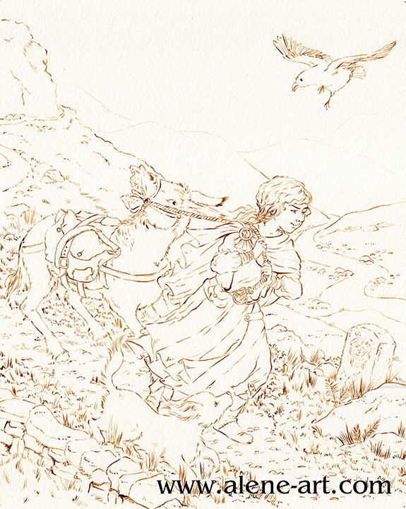
I'd picked up The Islands of Chaldea, Diana Wynne Jones' last book, in the bookshop, and sketched this while I was reading it. It was a bedtime sketch, so not particularly imaginative in terms of layout or anything, just a rough sketch based around a scene in the book.

For my assignment I didn't actually want to illustrate The Islands of Chaldea, but I thought the basic idea of a donkey that didn't want to go was a good starting point, especially as it had been suggested that I look at Tony Diterlizzi's work. To actually be an illustration for The Islands of Chaldea the girl would have to have brown hair, the raven would be a parrot, the donkey would be pulling a cart, there would be several other people and the dog would be a magical cat. 

Here is the rough thumbnail I did before I started sketching, just to check that the basic concept I had planned in my head over the previous few days worked:


I then did a rough digital sketch based around that thumbnail:


I kept each part in a different colour so that I could see what was what. Sketching can get messy and it's so easy to get lost in a mass of linework. 

I then did a refined draft linework, still digital:


As you can see, I flipped the image. Images read best left to right, but being right-handed I draw best in the other direction. Why fight it when I'm working digitally and can easily flip once the difficult bits are drawn? I also altered the donkey's expression quite a lot, to make sure it was very clearly not happy.

I had planned the image with a diagonal cut across the composition, as Arthur Rackham had been mentioned in our first conversation. I did my honours thesis on Golden Age Illustrators, with a fairly heavy focus on Rackham and Dulac, so as a bit of a nod to him I utilised I popular Golden Age compositional trick, where the composition is cut diagonally, with most of the action happening in the bottom half. This was originally inspired by Japanese woodcut compositions, after the trade borders opened up in the 1870s and it's a composition I rather like.

All these images are from my Golden Age Illustration Pinterest board. Head over there if you would like to see them bigger.

Finally I did a colour study. Not only was I going to be using a colour scheme that wasn't my usual one, but a lot of the parameters for my assignment had to do with colour and linework - none of which come across on a digital draft!


I sent this, and the draft linework, off. Giuseppe was generally happy with it, his only concern being that the raven was the only dark part of the image and threw the balance off. He suggested I darken the tones in the foreground to fix this, and gave me the go-ahead to start on the final.

Before I could start on the final, however, I had to get some ink. Easier said than done in Western Australia! I went to my local art shop, wanting waterproof ink in any dark colour that wasn't black - sepia, dark grey, paynes grey, I wasn't choosy, but the shop wasn't very helpful. In the end I managed to snag some FW Acrylic Artists Ink in Burnt Umber. It's only water resistant, not waterproof, so if I was really working the watercolour in some areas it got a bit lost and I had to go back in and touch up, but overall I think it worked well. I also bought a cheap 2/0 sable brush so that I didn't kill my expensive brushes with the ink.


Having completed the inking it was time to paint. These are the materials I used:


The red tones were used the least. I researched dead palettes before I started, and a lot of the info stressed the need for one spot of bright, saturated colour. In my case it was the hair of my girl character. I used Cadmium Scarlet and Winsor Orange for her hair, and some Rose Dorè on her skin. Indian Red added the lowlights in her hair, and was also used on some of the browns elsewhere in the image, so that the red tones were spread just a little. 
It's almost entirely watercolour, but I did get out my coloured pencils at the very end, just to darken some of the shadows and add some extra leafiness to the vegetation in the foreground, and also darkened a couple of lines with a sepia PITT Artist's Pen (not shown). 


I sent the above image off to Giuseppe and we discussed it during my final conference. 

He was happy with it, and especially pleased with my use of leading lines (in the pathway and the river) and my treatment of the fabric and the figures, but flagged a few places where it could be improved:

The sky was a bit too busy
The figures didn't stand out from the background enough
The dog got lost

I agreed with everything he pointed out, so after our meeting I took the painting into Photoshop and made some adjustments:


What do you think? An improvement? 

The sketch, being a complicated one where I was trying new things (especially with the donkey) took about 9 hours, I think, and it took another 14-18 to paint it, although there were some pauses in there while I waited for paint to dry.

Wednesday, September 2, 2015

Illustration: Mariella

My current batch of work requires a lot of waiting, so I've been using the intervals to create personal pieces, so here is a new illustration!


At the moment I am writing the story to go with this. We shall see how far I get!

I'd been toying with the idea of creating a kidlit illustration with a ghost in, and doodled a little character study of a 17th Century character that I named Mariella:


I chose the 17th Century so that there would be a big difference in costume between her and any modern children I drew with her. I wanted it to be obvious that she had been a ghost for a very long time. I browsed Pinterest for 17th Century children's clothing and settled on a date in the 1660s, when costume was rather swashbuckling. 

I did a few thumbnails to play around with compositions, picked the one I liked best, and worked that up. Here's a progress animation of the whole process:


Having settled on my thumbnail (almost illegible, I'm sorry) I sketched up a slightly more detailed plan in my sketchbook, and then took the whole thing into Photoshop to do a draft. Having done that I slapped a bit of colour on to see how everything worked. At this point I made some changes, most noticeably raising the boy's arm so that he could hold a torch. I had been planning on having everything lit with a ghostly blue light, but a flaming torch is more dramatic! 

I then did some tight linework and started painting. The torch was one of the first things I did, so that I could keep the lightsource in mind as I went. In general I like to work with linework, but as I didn't want black outlines everywhere, I painted the linework as well. In places where a bit more definition was needed, I allowed some contrast between the painting and the linework, and where the linework was no longer so necessary, I let it blend in almost entirely. 

It was fun figuring out how best to paint Mariella. As I was painting digitally I could try various things as I went, so you can see her change slightly as I progress. She was always going to be transparent, but I used a layer mask so that I could adjust the transparency to suit - Mariella herself is completely painted (in shades of blue), in case I decided that I wanted her feet visible after all.

I used a couple of textures from cgtextures.com - for the stonework and the door - to speed things up a bit, but other than that, everything is painted by hand on a Wacom Cintiq Companion 2 in Adobe Photoshop CC 2015. 

Sunday, August 9, 2015

Illustration: A Wrinkle In Time

I did this as a personal illustration exercise. I was reading Madeline L'Engle's A Wrinkle In Time and found the cover and internal illustrations rather bland, so I decided to set myself a project to make a new cover for it. 


This was a good opportunity to practice various things that I don't do too often - people floating, space, decorative text....

Here's a progress animation composed of various screenshots I took while I was working:


Adobe Photoshop CC 2015 on a Wacom Cintiq Companion 2. I created some pose models in Manga Studio 5 as well, to give me a starting point for the unusual positions of the figures. 


Wednesday, July 15, 2015

Illustration: Ahmali

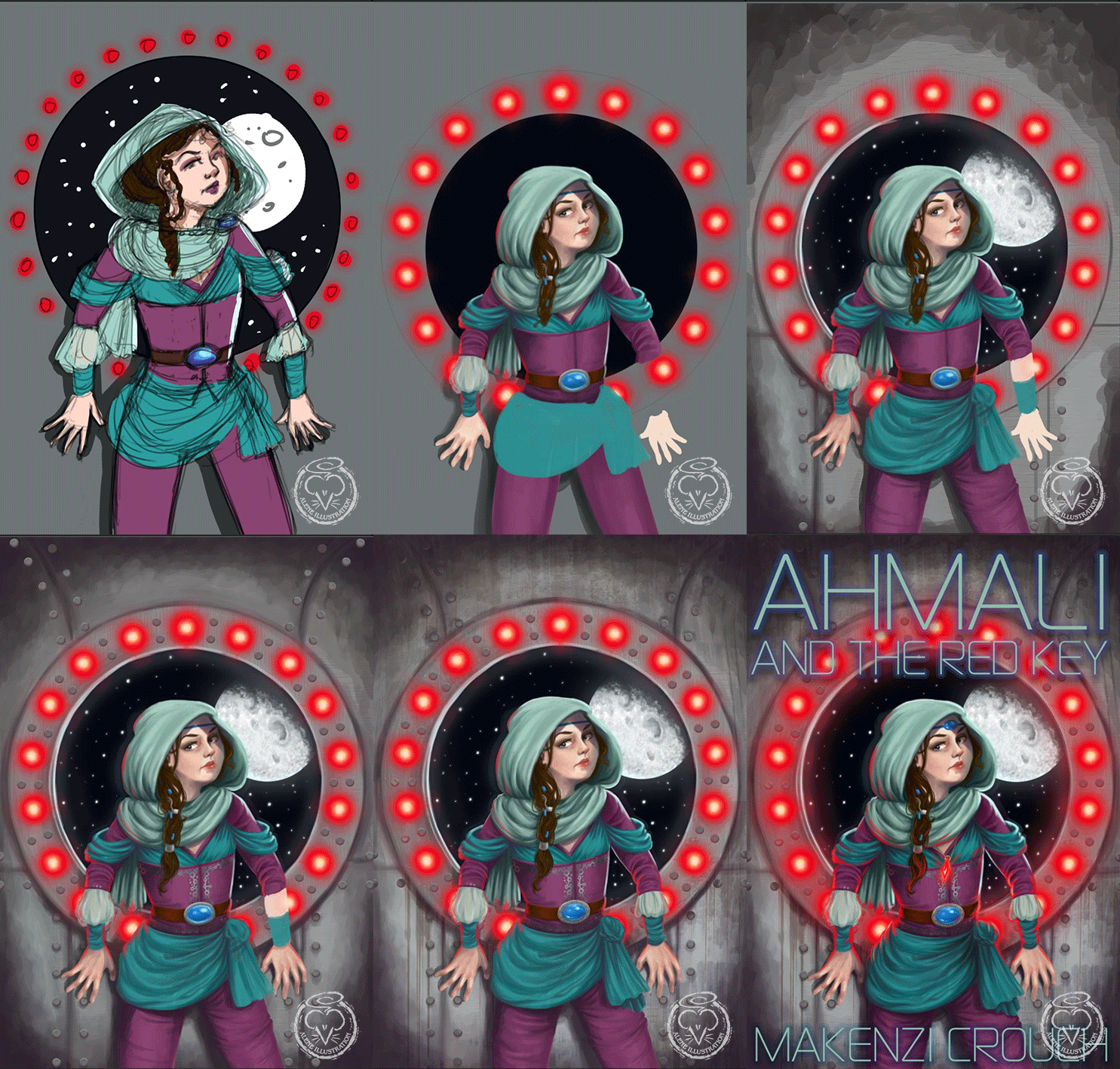
Remember my Colour Collective Aubergine? I said I'd like to work up the general pose into something better... and I wanted some more book covers for my portfolio, so I've come up with this:


This picture inspired my friend Makenzi Crouch to muck about with a bit of a story for this character, to go with the cover - so when it came time to add text, I used her name instead of coming up with a random imaginary author. And let's face it, she's got a pretty awesome name for an author, hasn't she?

Here's the cover without the text:


I really just let this piece go where it wanted, which was fun. I didn't have anything I had to keep in mind, no specific character to draw, no specific scene, no client to please - I just started with a fuzzy photo reference of myself in the pressed-against-the-wall pose, decided that the vastness of space outside would make the nowhere-else-to-go idea more dramatic... and then I just had fun with the costume and a general sci-fi atmosphere.

Here's a progress gif showing how this came together:


Adobe Photoshop CC 2015 on a Wacom Cintiq Companion 2

Thursday, June 4, 2015

Illustration: The Masqueraders

I needed some more cover art in my portfolio, and as I was listening to Heyer's The Masqueraders when I decided this, I thought I'd see if I could create a YA-style cover for that story. I first read it when I was about 13, and the plot of a brother and sister switching places amongst political intrigue and romance was a fun theme that could conceivably belong to YA lit. 


Here's a progress animation of the main steps I took in creating this piece. There are hints in the earliest stages of a more complicated background, with silhouetted vignettes, but I eventually discarded that idea and stuck with something a bit simpler. 


This was a good exercise in drawing characters, as each character I had to draw twice, and they each had to pass as both a man and a woman. I couldn't just copy the faces 100%, but I tried my best to maintain all of their features. It's tricky when you don't have hair and clothes to fall back on!

For those unacquainted with the book, the bottom half of the picture has the characters the right way round, with the girl in the red dress and the boy in blue (They spend most of the book playing their opposite gender). Here's an inverted version so you can better see them:


I don't really have any idea how long this took, as I worked on it in small bursts of free time over the past year. It definitely didn't take long enough to warrant the whole year though! 

Adobe Photoshop CC with a Wacom Intuos Pro 5 and a Wacom Cintiq Companion 2
I looked up period references for the clothes and took my own references for help with the (always tricky) hands, but otherwise, no direct reference.

LinkWithin

Related Posts Plugin for WordPress, Blogger...